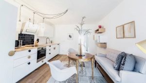
Kitchen Studio
Advantages and disadvantages
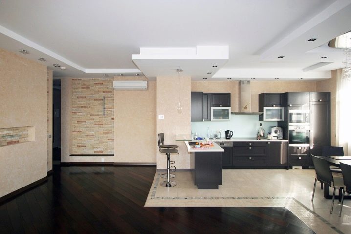
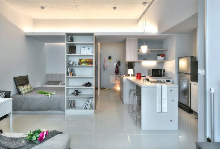
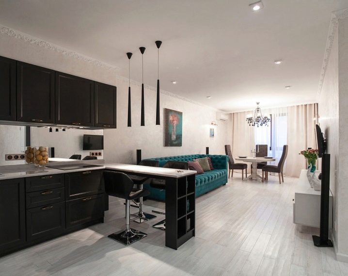
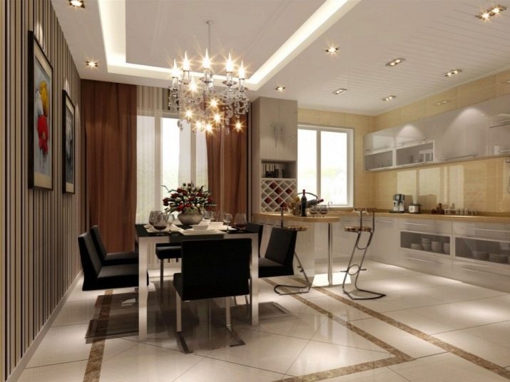
In modern apartment planning, it is not always possible to allocate each important housing area a well-deserved space and properly equip a room. Most often, the kitchen area is small and inconvenient. To increase the space of the room and get rid of partitions, combine rooms. This location can be created independently or buy a studio apartment with a free layout. The common space often combines a kitchen and living area - this is called a kitchen-studio.
When deciding to combine two rooms, pay attention to some nuances.
If you carry out redevelopment yourself, you must contact the appropriate authority for permission. It is necessary to carefully examine the floor plan, wall structures. Demolition of the bearing wall in the apartment is very dangerous and can lead to the destruction of the house.
Kitchen smells are not always pleasant and not always in place.It is worth taking care of a powerful ventilation system in the combined room, but, you need to choose not too noisy models. The optimum noise level is up to 40 dB.
Redevelopment is a costly process. If the kitchen-studio is not provided for by the plan of the apartment, you will have to do it yourself: wall demolition and decoration, removal of an impressive amount of garbage.
Frequent cleaning. The kitchen is the most frequently and heavily soiled area. It will not work out only in it and leave the rest of the kitchen-studio space not tidy. After cooking, you have to clean and wash the dishes immediately. To facilitate cleaning, you can install a kitchen set or a work area with a smooth surface, zone kitchen space with tiles on the floor and walls.
This layout increases the space of the room, it does not seem cramped and uncomfortable and allows you to move freely. Ideal for small apartments, where the project of the living room and kitchen are divided by a partition into too small areas.
When cooking dinner you will not have to leave the living room and interrupt a pleasant conversation. You can always talk with guests and households, ask for help.
Special features
To competently combine the space of the kitchen in a one-room apartment or in the studio you need to know about some of the nuances. Compliance with them will help to properly distinguish between all indoor areas, so that each household has got its own "corner".
First of all, it is necessary to determine which zone will be the main one. The kitchen-studio can combine: dining area, cooking area, bedroom, rest area and storage.
Separating, for example, a dining area in terms of an apartment will allow a group of friends to gather at a delicious dinner. Cooking zone - for gourmets and cooks. This layout will allow you to observe the masterful preparation of a delicious dinner. Living room - for a comfortable stay. The correct choice of the main space depends on the owner's lifestyle, love for noisy companies or family gatherings, cooking.
Apartments in new buildings with a free layout? Not certainly in that way. It would seem that there are no internal walls - you can make any layout. But, it is worth noting that in terms of development, bathroom and kitchen zones are always indicated, their transfer is not always a simple process.
It is not necessary to arrange the kitchen studio in different styles.For zoning it is better to use other techniques, and the combination of incompatible style preferences will look ridiculous. Only closed premises in one apartment can combine different stylistic decisions.
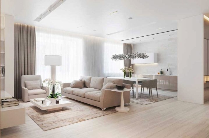
A large number of dark shades in the interior of the kitchen-studio visually reduce the space. If the area is small, you should not use a lot of black, dark brown, purple flowers. Cozy and lighter room will make warm colors and shades.
Mini mirrors, glossy surfaces of furniture together with stretch ceilings with a glossy texture will help to visually increase the space. These surfaces are excellent reflectors of light. Installing glossy cabinets from the ceiling itself will allow you to visually expand the space and create a large area for storing kitchen trifles, dishes and food.
The use of stretch ceilings in the kitchen is fully justified. Dust and pollution spoil the whitewashing and ceiling wallpaper, leaving soot on them. To maintain the stretch ceiling in its pure form, you only need to wipe it with a damp cloth 2-3 times a year.
For furniture choose easily washable materials.Smells from the kitchen are quickly absorbed into the fabric, especially natural. Easily washable fabrics and replaceable covers allow for better cleaning.
More attention should be paid to lighting. Illumination will help to divide the zones of the room and make them more comfortable. You can brighten up the kitchen and work areas, while the living room and bedroom will have soft and warm lighting.
If the plan of the apartment involves a spacious balcony or loggia, they can also be used. On the loggia will fit comfortably work area or recreation area. To stay on it was comfortable and in the winter, you should take care of the insulation: high-quality double-glazed windows, heated floors or extra battery. On the balcony is very nice to have breakfast and enjoy the panoramic view from the windows.
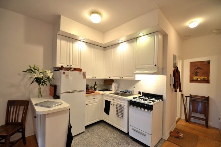
It is not so easy to furnish kitchen space, especially if it is angular, you can use the rule of the working triangle. The area of the cooking zone is divided into three main areas: refrigerator-food storage, sink-washing dishes, stove-cooking. When moving from one point to another, there should be no transitions, thus eliminating unnecessary movement, saving time.But do not place the refrigerator close to the gas stove, so it will consume less electricity.
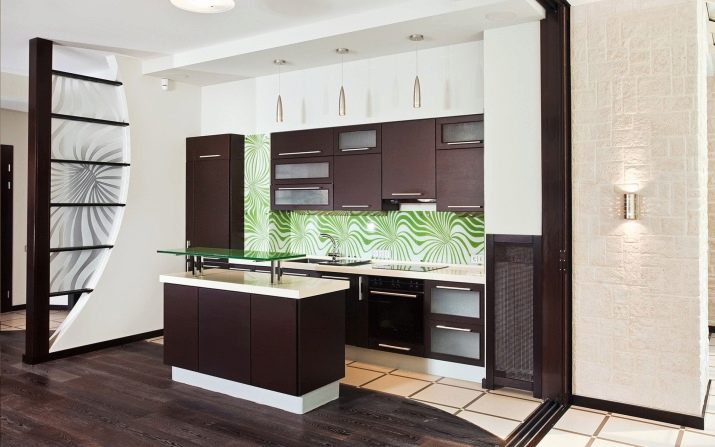
In order for each family member to spend time at home comfortably, be sure to use zoning. In modern design, many options have been developed and applied: multi-level premises, zoning with color, furniture or sliding partitions, bar counters with additional designs for fruits and dishes.
Interior Design Ideas: Options
Consider the options for planning a modern spacious kitchen-studio.
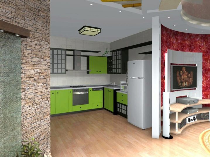
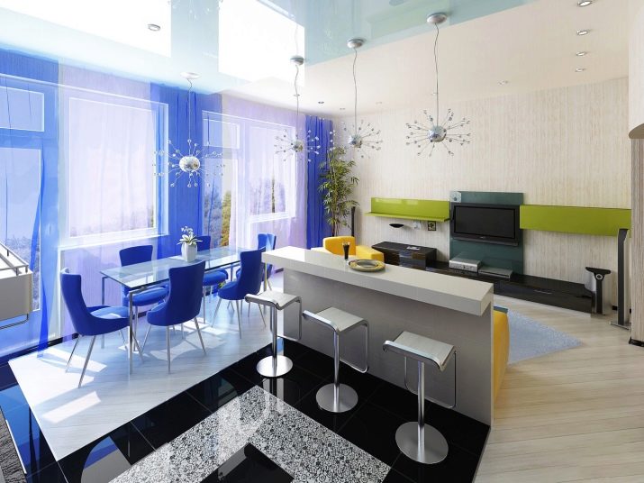
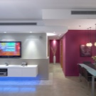
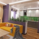
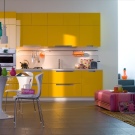
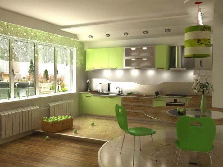
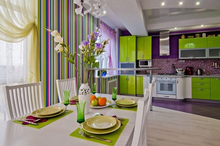
- Color zoning. This option can be combined with other solutions - Flooring, walls, ceilings, furniture - a wide field for imagination. For the main zone, you can choose a color palette, textures and materials that contrast the rest of the space. For example, the kitchen can be made in rich yellow-green shades, and the remaining space in bright colors.
But do not forget about the reasonable use of different colors. The combination of three or more bright contrasting colors in the finish will create a fractional impression. Maintain the color of the main area of various decor items and kitchen utensils.
Contrasting can be not only finishing, but also furniture, accessories: bright curtains for the hall or dining room, upholstered upholstered furniture, pillows and even appliances. But, you should not make a design only in black and white color, it will create an unpleasant and uncomfortable feeling.
Examples of color zoning can often be found in modern styles: “minimalism”, “loft”, “techno”, “Provence”, etc.
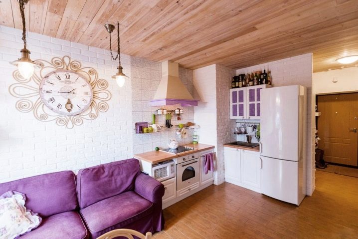
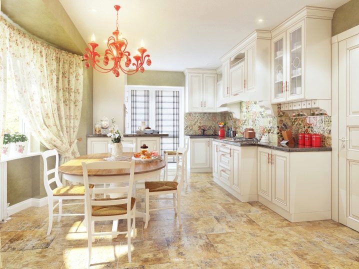
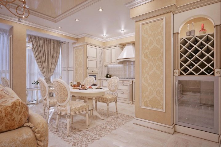
For the style of "Provence" light pastel shades: peach, beige, lavender, blue.
The space of the kitchen and living area can be solved in light beige or peach tones. Natural materials will be a big plus. Wooden table made of light wood, chairs with soft seats on slightly bent legs, cabinets painted on pastoral themes. Kitchen apron can be laid out with a light tile with a grass ornament or an image of wild flowers.
- Shine. Visual separation of light is not an easy task. It is not necessary to place lamps on the border of functional zones. It is possible to brighten the spaces in which lighting plays an important functional role: the kitchen, work area and dining area.Soft warm light is perfect for a recreation area, will help to relax after a hard day's work.
Unusual zoning with lighting can be created in the style of "loft". If the height of the ceilings allows, a large metal chandelier / spotlight can be placed above the dining area; it will give a fairly bright overhead light, which is very convenient for eating. Small spotlights can be embedded in the bottom of hanging kitchen cabinets, this will help illuminate the working area of the kitchen. In the living room, on the tables and shelves, small designer lamps in the form of ordinary incandescent bulbs will fit perfectly.
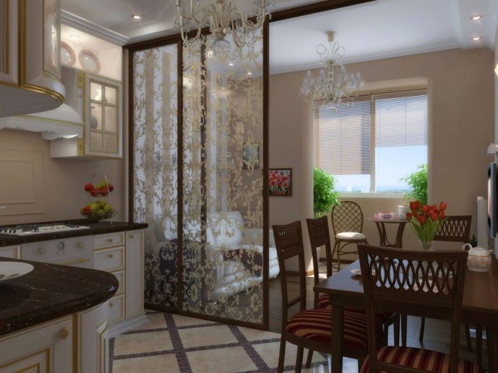
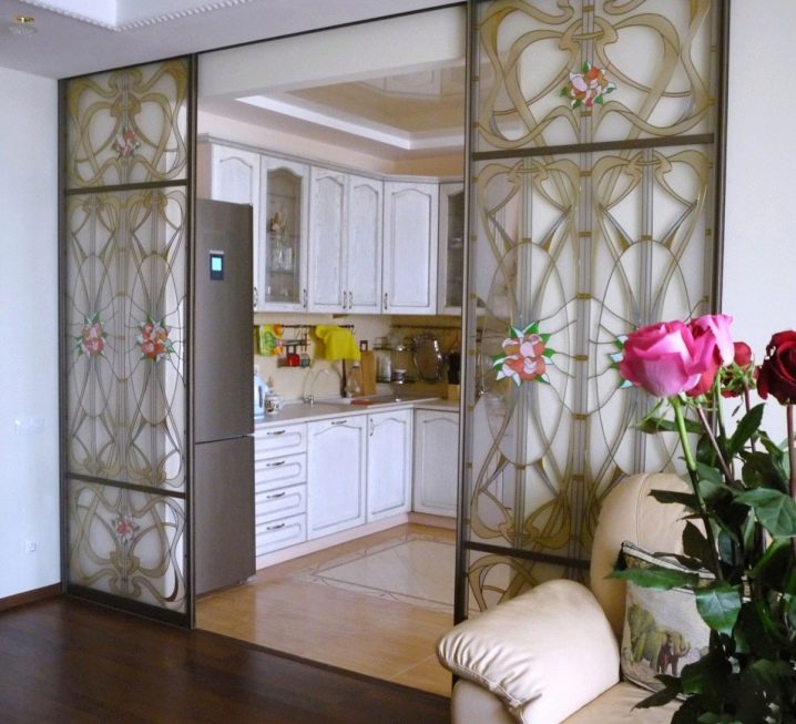
- Sliding partitions. The most convenient and practical option will allow you to separate one zone from the others. This screen can be used to separate the sleeping area or kitchen area. To make this design not look heavy, you can choose from light or translucent materials: frosted glass, stretched fabric or stained glass. Beautiful pattern on the partition wall will be a real decoration of the interior.
The stained glass partition will perfectly fit into the style of "modern", it is characterized by smooth lines of the interior, carved wooden furniture of intricate shapes,glass stained glass.
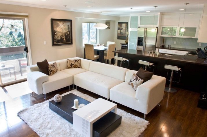
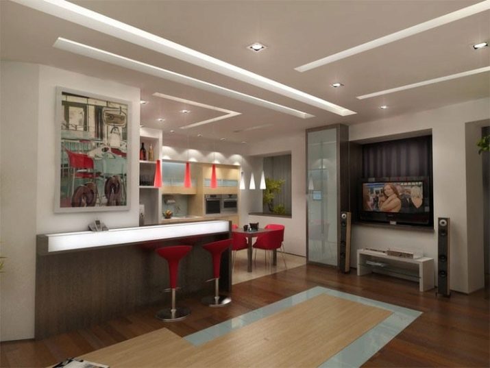
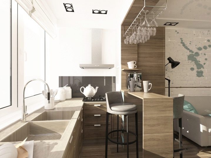
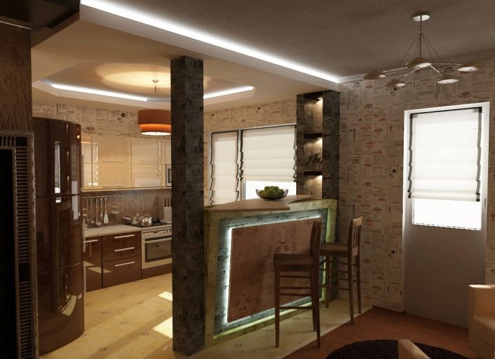
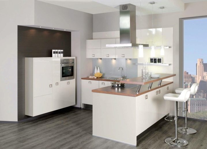
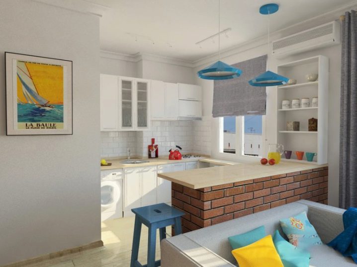
- Bar counter. An indispensable piece of furniture for a modern stylish interior. Advance it is necessary to take care that the design of the bar counter matches the main interior in material and color. The table top can be selected from wood or high-quality MDF. Wood can be varnished, and the MDF table top looks good in a glossy finish.
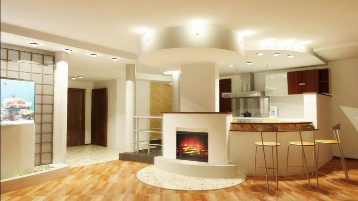
The space under the bar can be used for storing cereals or kitchen utensils. This rack can be placed on the surface of the sink and the cooking surface. Suspended modules for fragile dishes will complement the design. A fairly wide countertop surface will be a substitute for a dining table.
The laconic bar stand of a simple geometric shape will fit into the Scandinavian style. In this embodiment, you should not be afraid to use light and white colors of cold shades: blue, gray, pale pink. Wooden surfaces and inserts will be an excellent addition.
The material for the bar in the Scandinavian style is easy enough to pick up, a stone or a wooden array is perfect. Mostly varnished solid wood will look,but this material is quite expensive.
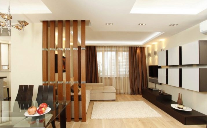
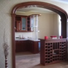
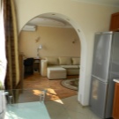
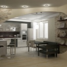
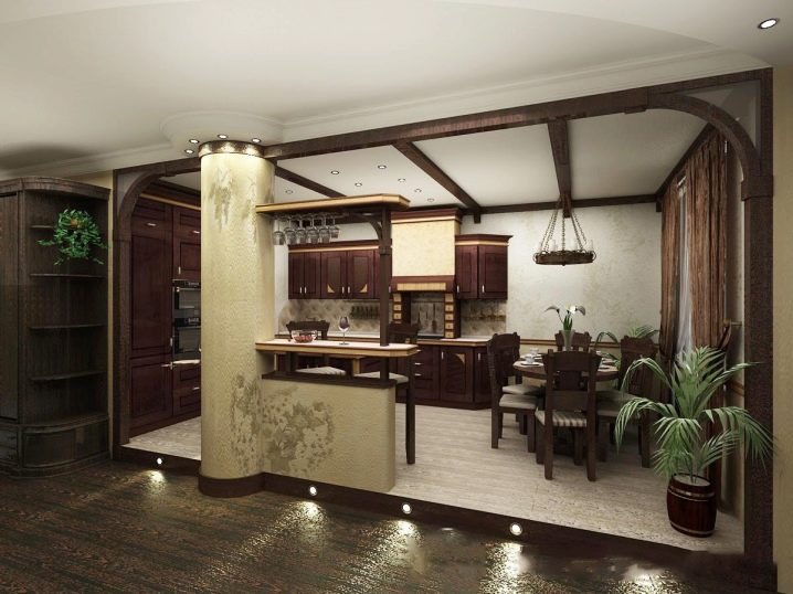
- Partitions of different materials. Often there are drywall and wooden partitions. Depending on the space and style, you can choose the options: arch, straight or other unusual forms. The arch variant will allow you to gently separate the two zones, if you install spotlights in the thickness of the structure.
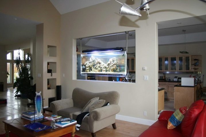
You can experiment and make the partition pass-through. With sufficient thickness in the empty spaces fit books, beautiful statues, kitchen utensils, or even an aquarium. If the partition is installed from wall to wall, in the middle you can make a large opening or “window”, it is very convenient to place a tabletop in it, which will replace the bar counter or dining table.
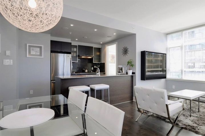
A simple partition without curved lines with a “window” will fit into the “high-tech” style. Its main characteristics are:
- Using the latest technology, materials and designs. The equipment made of chromed metal will perfectly fit into the “hi-tech”, there is no need to hide it in built-in cabinets.
- Smooth transitions and curved lines are completely excluded. All contours are clear and straight.
- Simplicity and minimalism in furniture design.The functionality of the interior in the first place. Here the tabletop is a simple rectangular shape. In the thickness of the partition can be placed lamps made of chrome-plated metal.
- Primary colors: white, black, shades of gray. All glass, metal structures retain their natural color. Upholstery and other textiles should not have patterns or ornaments, it is better to choose plain fabrics. The main zone can be distinguished by one bright spot, it can be a contrasting color of the sofa or the cabinet.
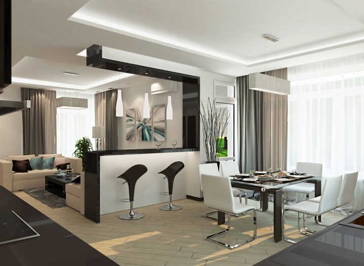
- Furniture items made of wood should be avoided. You can use plastic, glass, chrome-plated metal. The table top in the partition can be made of thick glass or durable plastic. Complement its high bar stools with metal legs.
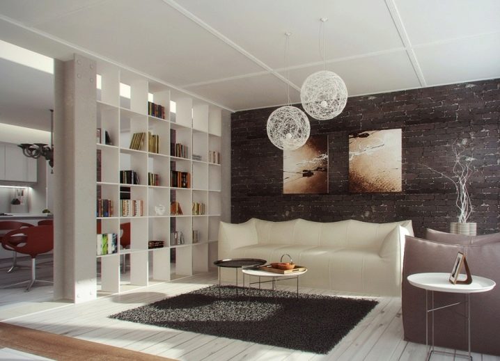
- Furniture. Furniture partitions perfectly delimit the kitchen space. It can be: a sofa, a wardrobe, a bookcase. Wardrobe, for example, you can choose a mirror version, such a surface will reflect the space of the room and make it more visually. In the bookcase, small knick-knacks, frames with photos and books will fit perfectly.
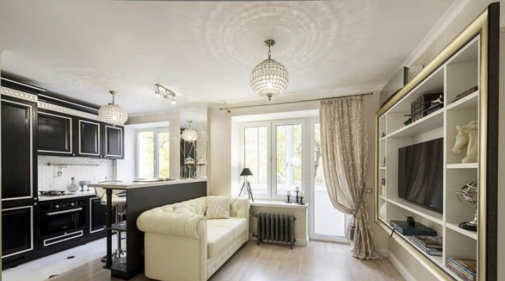
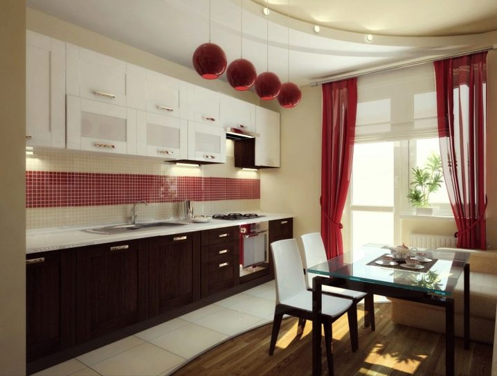
A classic-style kitchen studio can be demarcated by a large, light-colored sofa or wooden shelving. Light colors are typical for a classic design: beige, light brown, white, contrast can be brought in through rich burgundy.
Here you can not be afraid to use ornaments and decorations. A sofa with an embroidered ornament, a mirror with faceted inserts, curtains for the hall from dense fabrics with frills will perfectly fit into a classical interior.
A fireplace facing the living room will make the atmosphere cozier and warmer. But with the fireplace often combined spacious rooms, do not forget about it.
It is better to decide to make the walls in light colors, and you can choose burgundy textile curtains or upholstery. Complement the interior with soft pillows, upholstered chairs or painted light wood. Warm lighting will create floor lamps from a fabric shade with golden ruffles. The carpet in the living area, you can choose a simple monochromatic or symmetrical pattern.
In the kitchen area fit wooden cabinets beige or brown shades with carved white or gold-colored handles. Technique, electrical appliances better hide in cabinets and cabinets.
- Different levels of space. The delimitation of the area of the kitchen-studio by levels is a good solution. There are many options for such zoning.
A small podium will raise the kitchen space above the rest. To enhance the effect in the height of the catwalk, you can insert spotlights or LED strip.
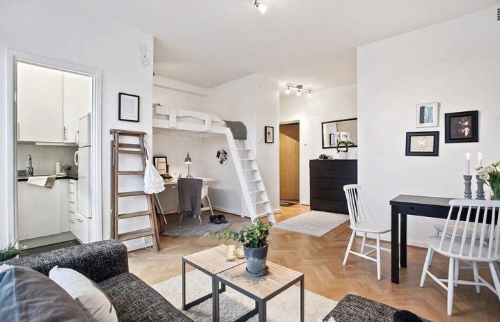
If the height of the room allows, the sleeping area is conveniently placed under the ceiling. The construction of metal or wood on small pillars or columns will sustain a decent weight. This will save enough space downstairs to expand the kitchen, living room or work area.
Such functional zoning is characteristic of the loft style. A low podium can be decorated with wood paneling or laminate. A high “second floor” of wood will look good in painting. The use of bright colors is suitable for this modern style.
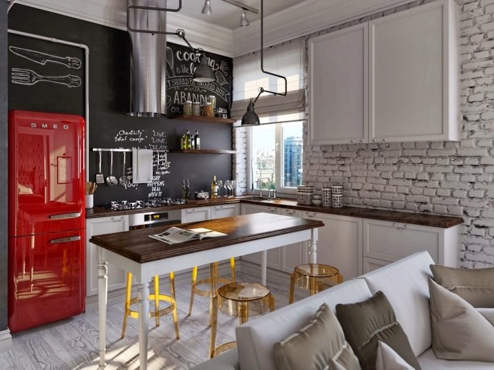
For example, careless painting of a tree in orange color will be perfectly combined with a purple carpet on the floor. With such a contrast, the rest of the interior is decorated in contiguous colors, then noble shades of brown, gray or white will suit.But, small details should support bright colors: pillows, soft puffs, lamps, etc. Experiments with a refrigerator have become a fashionable trend. From inconspicuous household appliances, it can turn into a real art object with the help of bright colors and colored stickers.
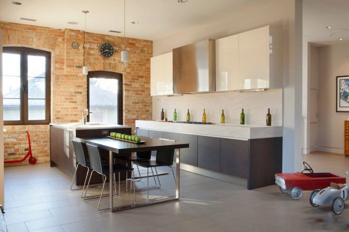
Wallpaper in the "loft" is used very rarely, more often the walls are decorated with brick masonry, wood panels or simply painted. Good will look great posters in frames with glass, watches with a massive dial, installation in the form of long metal tubes. Do not forget that the "loft" - the style of large spaces and space.
