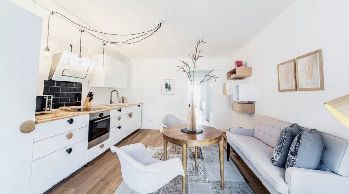
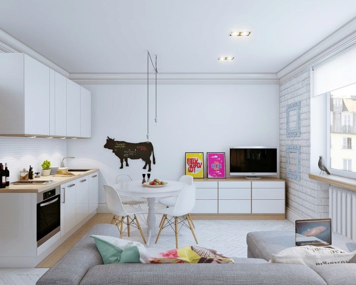
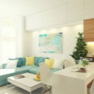
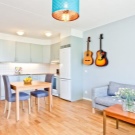
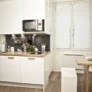
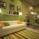
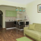
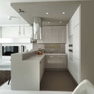
Design kitchen-living room of 15 square meters. m
The kitchen-living room has long ceased to be something special. The first studios appeared in the 20s of the last century with the light hands of architect Ludwig Mies van der Rohe, who proposed to unite the living space, removing all internal partitions in the house. The massive passion to demolish the walls between the kitchen and living room we had in the 90s. But if at first such a solution to the housing problem provided comfort for aesthetic individualists and young childless couples, today with the new way of life, the appearance of powerful hoods, silent and functional equipment, practical and unlimited materials in their color palette, in the open space they more and more often stop choice of ordinary families.
The advantages of living room kitchen:
- visual increase in space;
- the emergence of additional lighting (windows becomes more);
- convenience when receiving guests;
- increasing the zone of control and communication;
- exclusive design.
Time to make a choice
When choosing a combined studio, the nutrition, rest, and attitude to cleanliness is relatively common for everyone in the family. After all, cleaning, washing, on time, lay everything on the shelves and drawers will have to constantly, so that the sound of water or exhaust does not distract or annoy while watching TV, doing homework or receiving guests.
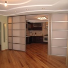
You can hide the working mess, protect the food and rest area with pollution by a sliding screen-screen, but this place will not save the lovers from those who like to spend a long time at the stove and cooks of extreme lovers: smells will spread throughout the room.
The kitchen-living room is ideal for people who, between kitchen and rest, always choose rest or advocate for equal but limited rights of both parties.
The advantages of the combined kitchen and living room will be more appreciated where there is no square meter problem, each family member has a separate room, and the budget allows you to equip the cooking area with highly functional appliances. For everyone else, the maximum effect of erasing the boundaries between the stove and the sofa is 15 sq.m.this is achieved by taking into account each decimeter of the area, thinking through all the details and elements: they must work for the person, and not the person to suffer from the dictates of the new interior.
Time to make plans
Before you demolish the wall, you must fix your aspirations in a detailed plan. You can "play" with existing project templates that fill the Internet, or reflect your fantasies on paper, and only then decide: contact a specialist or repair can be done on their own. There should be no encroachment on the bearing walls, they are responsible for the stability of the entire building.
Do not forget! Redevelopment in an apartment building (demolition of the walls, increase or decrease in the window opening, transfer of engineering equipment) requires coordination and permission of the respective urban structures.
Living room kitchen zoning:
- work zone;
- dining area;
- recreation area and entertainment.
The layout of each of the zones is determined by the shape of the future room (square, rectangle, complex configuration), the location of windows and doors, as well as the already laid communications (gas, water supply).The scale and accents depend on the lifestyle of family members and the dimensions of the proposed furniture, the size of the equipment.
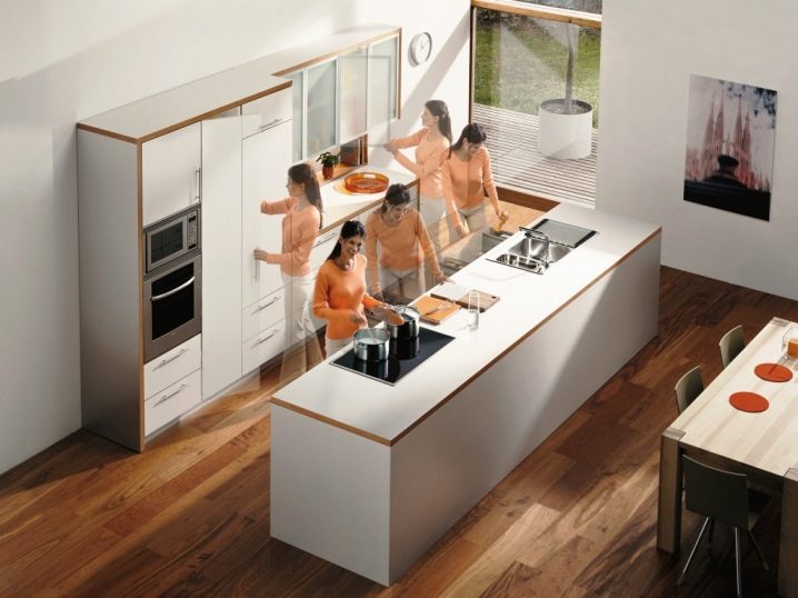
Allowed admission. Kitchen-living room logistics has traditional solutions, but in modern families parking and transit places may differ significantly from these schemes. For example, the classic content of the “working triangle” - a refrigerator, stove, sink - can be changed to a refrigerator, microwave, sink. In this case, the stove will no longer be part of the central composition, and more space will go to the place where the dishes are washed. So place the elements of the interior is not where accepted, but where you are comfortable. Just remember that the main kitchen objects should fit into an equilateral triangle, whose perimeter will not exceed 6 meters.
Getting started dancing from the stove
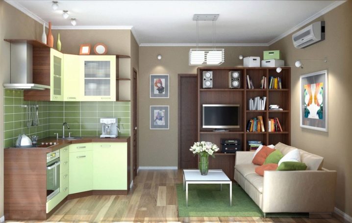
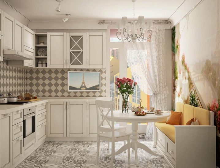
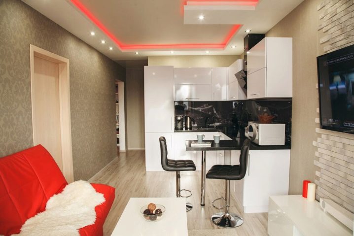
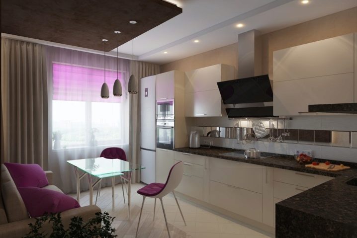
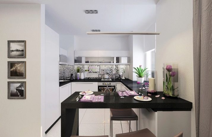
For open space, classical kitchen solutions remain relevant: single-line, double-row, corner, U-shaped and “island”. The corner is the easiest to fit into any configuration of the room, the U-shaped and “island” are convenient for combining zones. The desire to keep as much “air” as possible in the room will force us to look for ways to alleviate the upper kitchen floor.Furniture of small dimensions and depth, the use of glossy, transparent facades, the replacement of the upper case with open shelves, including glass ones, will help to achieve ease.
Kitchen requirements:
- disguised with doors, sliding panels or integrated into furniture, countertops, drawers and cabinets household appliances;
- equipping kitchen modules with damping systems (silent, smooth closing);
- the use of silent exhaust increased power;
- immaculate in appearance, low or silent objects of small household appliances.
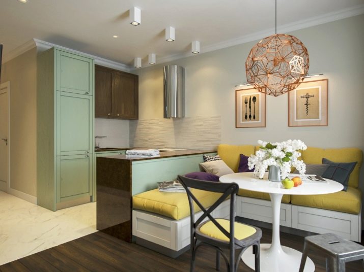
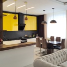
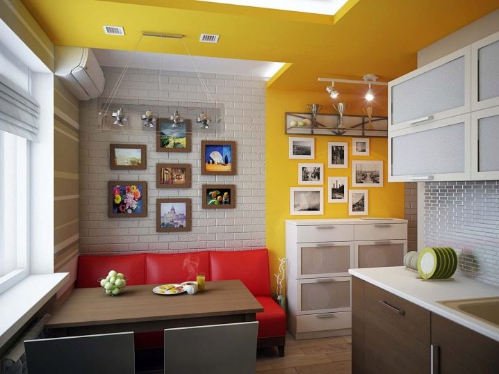
Of great importance is the color of the cooking zone. In the case of an accent, it can be bright, while transferring preferences to a recreation area, mimic the color of the walls or maintain a range of furniture in the living room.
Closer to the kitchen
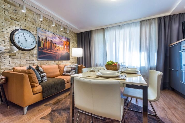
There are no special requirements for a living room solution, but it’s worth remembering that you don’t have much space for 15 square meters, therefore compactness and relatively small dimensions of furniture are preferred. The standard size of passages between static pieces of furniture is at least 90 cm. The possibilities for organizing space are unlimited: a place for family watching TV,a playground for the child, a dining room, a corner for practicing music, a bar for friends, a reading corner or an equipped workplace for a freelancer. It is the living room that sets the style of the whole room.
The sofa can be a great accent living room. It is necessary only to provide its dimensions and non-marking upholstery. The proximity of the kitchen and TV can cause irreparable harm to its appearance.
Art Deco, minimalism, modernism, pop art, popular eco-style, hi-tech and loft are perfect for a small studio in an apartment building. From the classic - Provence using clapboard when covering the ceiling or part of the walls. For country houses, the list of styles can be replenished with country and alpine chalets.
Modern design offers a combination of different styles and styles. This interior allows you to coexist completely different in mood and aesthetics of objects, creating an atmosphere of wandering in time and space. Convenient for representatives of different generations who will always feel at ease among the lines and details close to their hearts. In addition, eclecticism helps to achieve uniqueness, personality, unique to you,After all, the combination and number of "ingredients" is almost impossible to repeat.
Dual-Purpose Agents
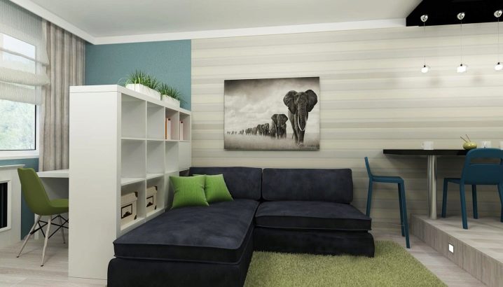
To combine studio space, it is very important to provide dual-use items. These can include a block for built-in audio in the form of a continuation of the kitchen cabinet, shelves of books, fencing sofa, display cases, storage cabinets, which can also serve as chairs.
The elements of dual purpose are made of the same materials as the furniture of the kitchen or living room, it all depends on the stylistic decision and the emphasis of the whole composition.
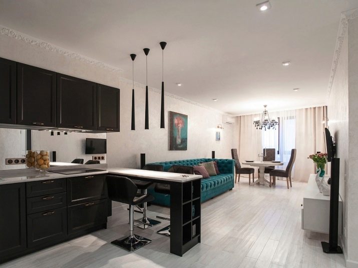
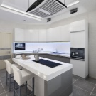
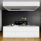
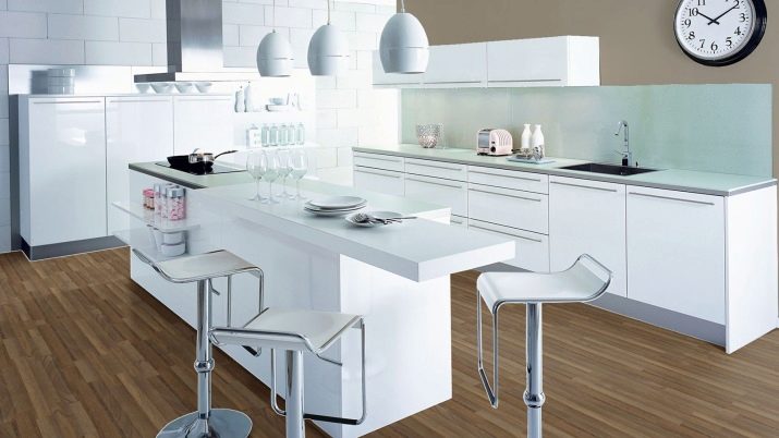
The “island” can successfully play the role of the Figaro studio: from the kitchen side it can be used as an oven, stove or storage space for utensils, and from the living room it can serve as a bar counter or the end of the dining table.
The height of the lower tier of the kitchen is usually 85-90 cm, the kitchen table is 72-76 cm, which means you will need a fantasy to dock the objects with the “island” or the use of semi-bar chairs.
For the kitchen of the living room 15 sq.m. It is better to limit the “islands” to a storage area or a working surface for preparing food.More serious responsibilities will require the laying of all necessary communications and ways to disguise them, which “eats” the space, so a full-fledged “island” is used in premises of at least 20 square meters. Mensola is a controversial element with a small footage.
Divide and rule
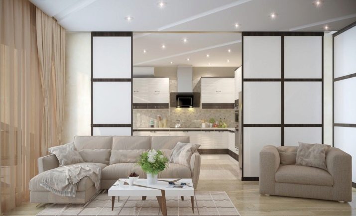
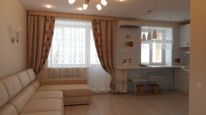
Integration in the same room of different designated areas requires a boundary. They can be obvious when the height of the ceiling or the floor is different, creating a podium, using various finishing materials that contrast in color and texture, creating sliding partitions, stained glass windows, columns, glass blocks, and dual-use objects on the line of demarcation. Lighting solutions are also well suited for this task. If there are windows in different zones, their design will help enhance the contrast of the zones. For example, if you use strict blinds in the kitchen and soft curtains in the living room.
Visually erasing borders helps close or the same color palette of the floor, ceiling, walls, the presence of the same color accents in the kitchen and in the living room, a single color solution of the entire room. The most economical option for combining zones can be the usual beautifully decorated wall.Sometimes simple solutions for small rooms are the best.
