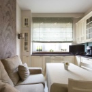
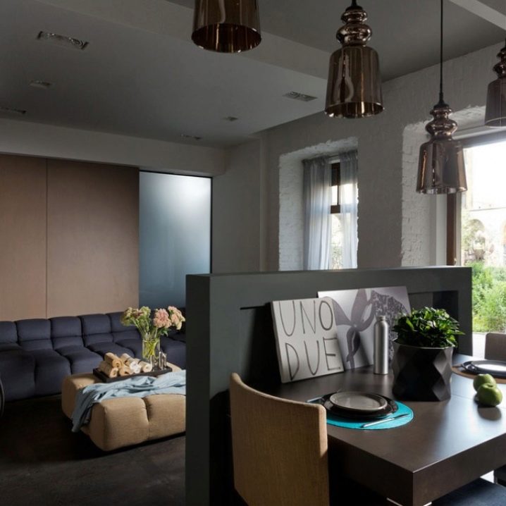
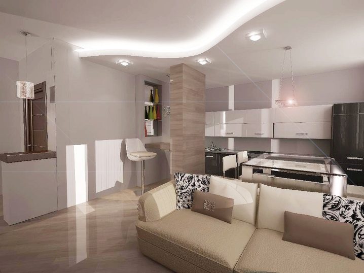
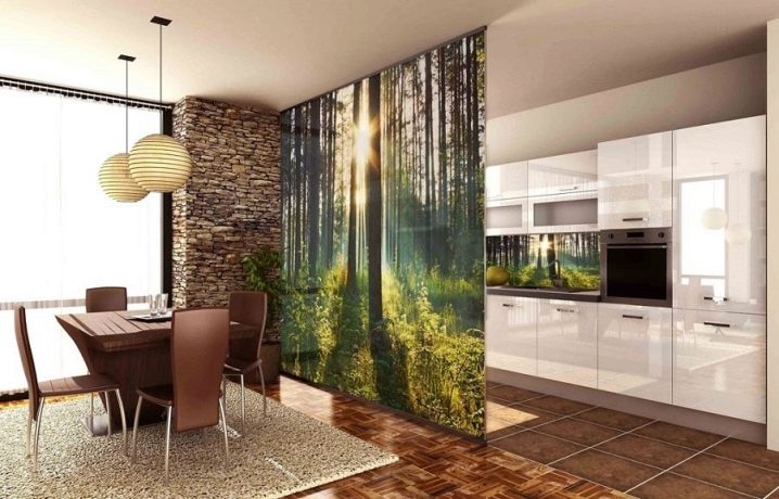
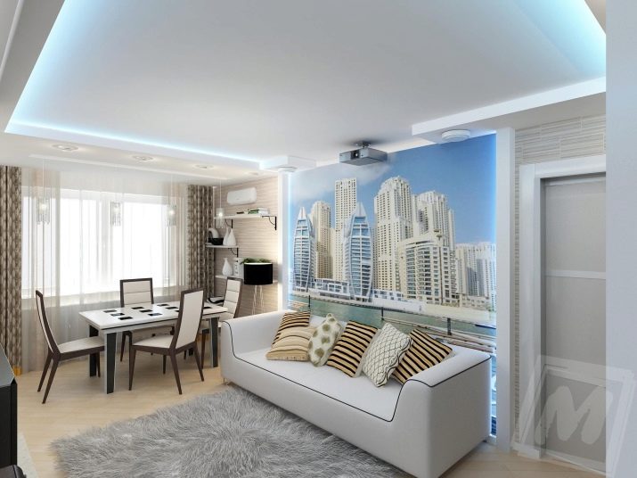
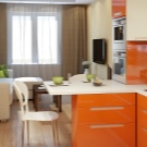
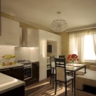
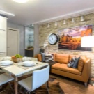
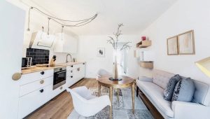
Design kitchen-living room of 17 square meters. m
Spring always wants a change. It doesn’t matter which ones: someone repaints their hair in a new color, and someone decides to make repairs at home. One of the fashion trends in the field of interior design is the idea of a combined kitchen and living room.
If you live in a private house, the space allows you to express your imagination and make all your dreams come true. But how to be the owners of standard apartments, because for such a project they will have to demolish the partition between the room and the kitchen, coordinate the documents in various instances - and all for the kitchen-living room of 17 square meters. Is the game worth the candle? Is it possible to combine two zones for different purposes in such a small area? After all, with the wrong layout, the room will not meet your expectations and fulfill its functions, but will become just a warehouse for diverse furniture.
Such an outcome is easy to avoid, if you approach the issue of combining the kitchen and living room wisely, think over everything in advance and take into account the recommendations of experts, the main ones are as follows:
- It is necessary to distinguish between two functional areas: kitchen - work area, living room - for recreation.
- The distinction should be only visual: you highlight areas of different functions and, at the same time, preserve the usable area.
- For a visual increase in space, use light colors, try to avoid gray and black colors - they not only act depressingly, but also visually reduce the room. You can add contrast using bright rich colors in the interior. The main thing is that all the selected shades blend harmoniously with each other.
- Pay attention to lighting. Properly selected lamps complement the interior, help in the separation of the room, make the room more comfortable.
Layout options
There are several typical layout options for a room in which a kitchen and a living room should be located together.
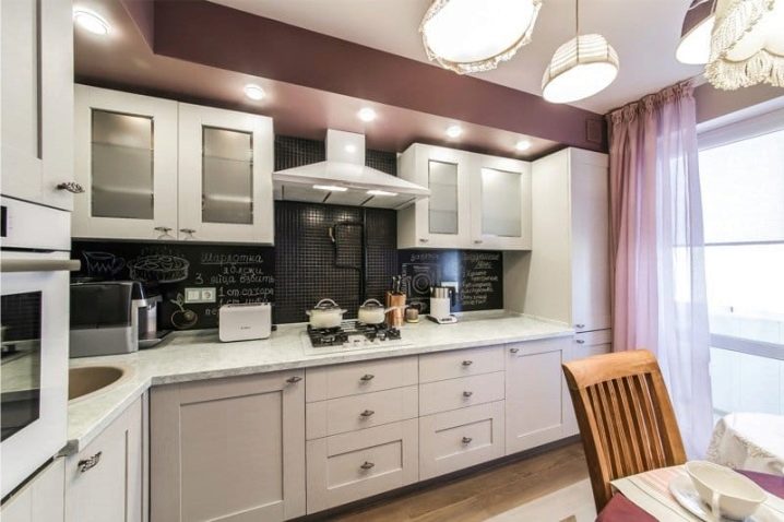
The most obvious option is a linear layout. Kitchen set in one row along the wall. Often this is due to the presence in the kitchen of the balcony or doorways. This layout is versatile and compact, it can be combined with an island (a table with drawers in the middle of the kitchen) or a bar.In everyday life it is inconvenient because the work triangle is too elongated and the hostess is forced to move along the entire headset. However, it is possible to increase the level of convenience of such a layout. For example, a refrigerator as close to the sink. The distance between the sink and the stove to make no more than 1-1.5 meters, and between them to place the cutting table. To provide enough space for storing kitchen utensils, cabinets will have to be made high, almost to the ceiling itself.
The second version of the layout is parallel. Kitchen furniture is located along the opposite walls. This option is used in narrow spaces. The disadvantages include the fact that kitchen cabinets take up a lot of space, and there is not enough space for passage between them (the required distance is 1-1.5 meters). Guest area moves to one of the edges of the headset.
The third version of the layout - the corner. The kitchen area occupies one corner, leaving more space for the living room. The stove, the refrigerator and the sink are set on the triangle principle, providing the hostess with a comfortable zone. Universal, compact layout.
The next option - U-shaped layout.It is convenient to use, especially if you place a stove, sink and refrigerator close to each other, and a cutting table that requires good lighting is near the window in the center of the headset. However, this requires additional work on the movement of communications. The disadvantages include the fact that such a kitchen can look cumbersome and takes up a lot of space, so it is recommended to install it in the kitchen-living room of 17 square meters in the event that preference is given to the working area rather than the rest area. Its advantages should be attributed to the fact that the kitchen does not require wall-mounted cabinets - there is enough space in the pedestals for all kitchen utensils. The living room can be placed at the base of the letter P, and the dining table - in the middle.
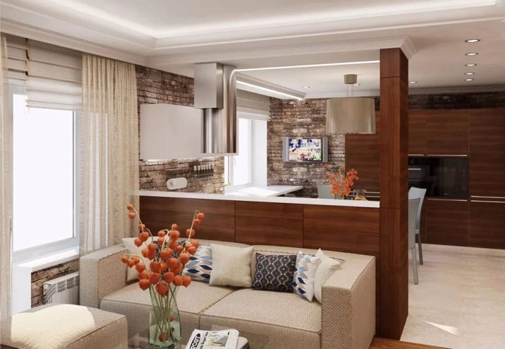
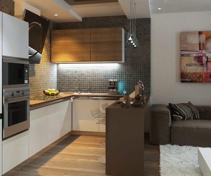
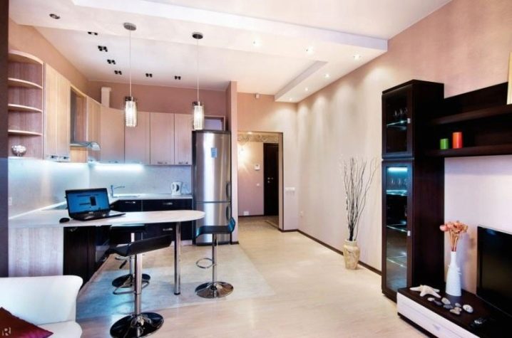
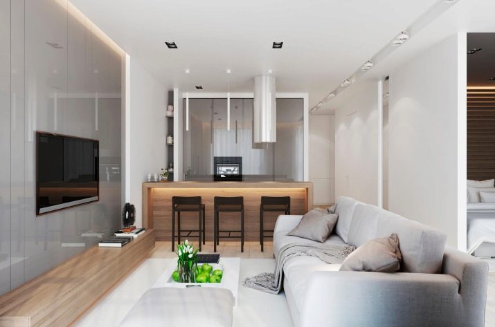
Another option - the peninsular kitchen. The peninsula serves table, which is a continuation of the kitchen set or at one end rests against the wall. Most often, a bar is used as a peninsula. Thus, the work area and the rest area are clearly demarcated.
Separately, you can select island layout. The island is a multifunctional table that is set in the middle of the kitchen, most often when a separate dining table is not required.This layout is suitable for spacious rooms. To use the island layout on 17 square meters, the island must be very small, because you must leave the aisles around it, so it loses its functionality.
Finish
Since we combine two different functional areas in the same room, it is necessary to choose the right materials for decoration. The ceiling should not only create comfort in the living room, but also withstand the kitchen atmosphere (steam, high temperature, etc.). The same requirement applies to flooring. For the kitchen-living room, the option of suspended ceilings is perfect; they do not heat up the dust and are easy to clean. Or you can use a safe water-based paint or PVC film, then you will be able to separate the zones, using your own color for each. It is better to lay the floor in the kitchen area with tiles - this is practical and convenient, and in the living room area - to use laminate or parquet. If there are no small children and old people in the family, you can make a two-level floor, raising the floor level in the kitchen by 15-20 cm.
The delimitation of zones can be made using various materials of the finish for the texture: wallpaper, plaster, wood panels. However, the whole room should be made in the same style.It should be remembered that light pastel shades increase the space and add light, as well as mirror and glossy surfaces. The black and white ornament and the alternation of vertical color bars make the room smaller.
Too many decorative decorations, deep kitchen cabinets, as well as bulky curtains take space. It is better to use blinds on the windows - they let in a lot of light, taking up minimal space.
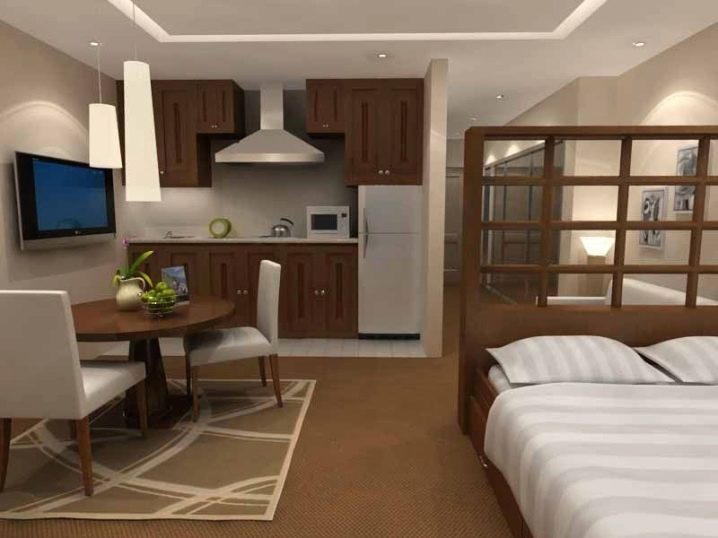
Another option for effective zoning of the kitchen-living room is the use of decorative screens, as well as large aquariums or flowers in pots. You can perform the figure of the arch or an unusual opening between the kitchen and living room.
Furniture should choose functional. Kitchen set should be easy to wash, have a lot of shelves and cabinets to fit all kitchen utensils. To save space, it is better to opt for built-in appliances. In the living room, in addition to the buffet, table and chairs, you should put a sofa and armchairs, otherwise the living room, originally conceived as a resting place, will turn into an ordinary dining room. The best option for small rooms - folding furniture (table, sofa, chairs).
In the kitchen there should be bright lights that illuminate the working space well, and in the living room, to create an atmosphere of relaxation, you can make more subdued light.
The main rule when finishing the kitchen-living room with a small area - the whole room should be decorated in the same style, the two zones should be delimited and at the same time look harmoniously together.
The best examples of interior design
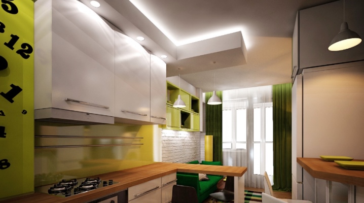
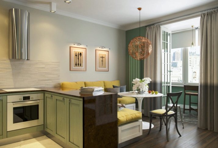
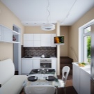
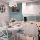
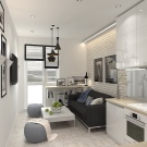
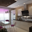
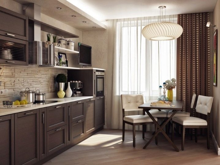
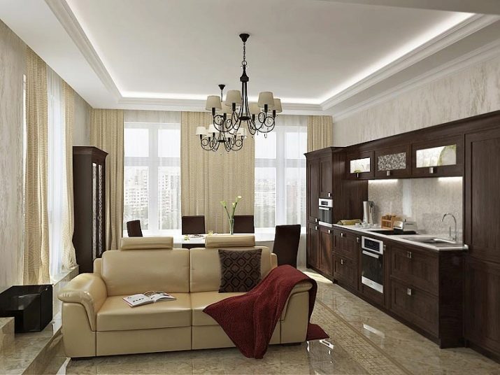
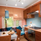
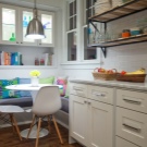
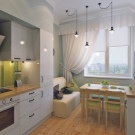
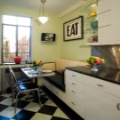
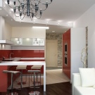
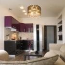
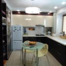
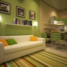
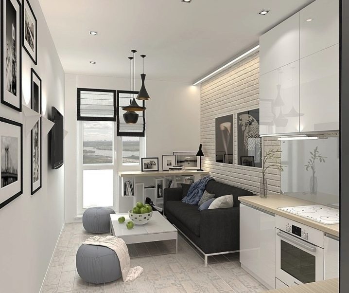
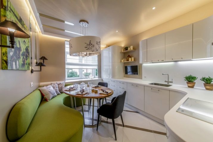
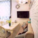
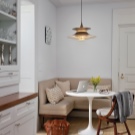
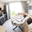
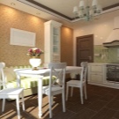
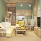
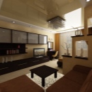
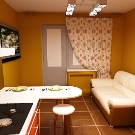
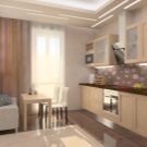
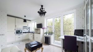
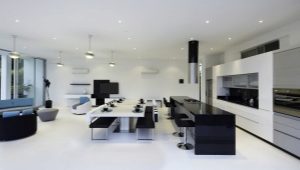
Before you start creating your own kitchen-living room project, think over all the details, decide on the design style, complete the room layout, and an excellent result will not take long to wait. Below are examples of successful solutions for kitchen-living room design.
