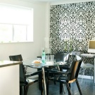
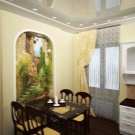
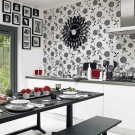
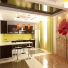
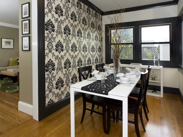
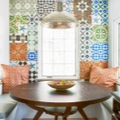
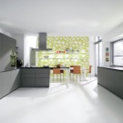
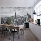
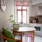
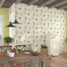
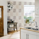
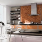
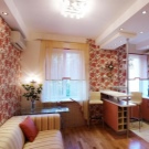
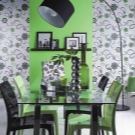
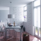
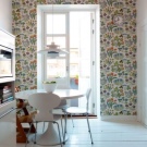
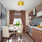
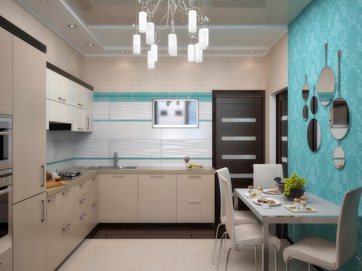
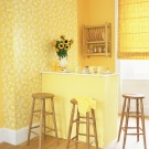
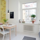
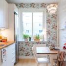
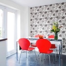
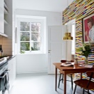
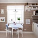
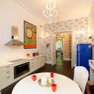
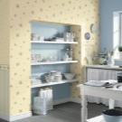
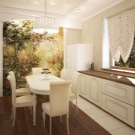
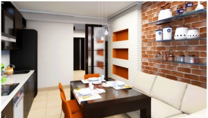
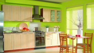
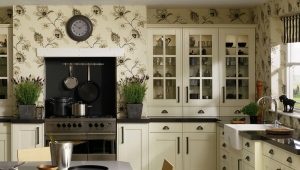
Combined wallpaper for the kitchen in the interior
Rules and principles of combining
The time passed when the only thing in the kitchen was its presence and functioning, when the main emphasis in the design of the apartment was placed on living rooms, bedrooms, guest rooms and children's rooms. It became clear that the kitchen is important not less than all the other rooms in the house and not only for cooking, but also for home comfort. And therefore its condition, equipment and interior should be given attention and show imagination in order to turn it into a corner of comfort.
But the combination, although it gives an opportunity to show imagination, but has certain rules, otherwise, instead of creative design, you can get a completely spoiled kitchen that causes only irritation. Let's try to decide what to look for and how to navigate in a wide selection of wallpapers. What design is better to choose for small kitchens, low ceilings, studio rooms.
Our attitude to the kitchen and its design has changed, only many have not changed the kitchen, often small, sometimes narrow and long with a mass of parts that are difficult to hide and impossible to remove.There was another option when it is necessary to solve a different problem, in the apartments of studios the kitchen is not spatially separated from the room, but I want to hold a visual section. In solving such problems it can be very useful to use the combined wallpaper. For such cases, the wallpaper for the kitchen is chosen so that it is not easy to paste over the walls with them, but also create an interior that will allow you to hide flaws, highlight advantages, divide the space into zones, harmoniously shade furniture and interior items.
First of all, it is worth remembering:
- This is a general rule when choosing wallpaper, for small rooms it is better to stay in bright colors, so visually you can enlarge the room.
- If you decide to combine wallpaper, then observe the principle of equivalence in the choice, that is, it is undesirable to combine expensive ones with cheap ones.
- It is very careful to combine wallpapers with different patterns, here you need to have a lot of experience and knowledge so as not to fall into bad taste. If you really really want to, then start with the simplest combinations of small geometric patterns with larger ones. For example, the combination of small cells with stripes.
- There is no doubt that the design in the kitchen should be designed in harmony with the furniture, appliances and decorative elements.
- When using bright details, keep your balance, dimming the bright detail in more calm tones.
- Especially for novice designers, it is important to pre-plan, choose the texture of the wallpaper, taking into account the condition of the walls, the area of the kitchen, furniture.
- Pay attention to the elements of the kitchen, which always seem to interfere (columns, ledges, niches, ventilation ducts). With a skillful combination, they can be an additional decoration of the interior.
What combinations of colors and patterns are the least risky to combine:
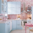
- Unobtrusive, but quite sophisticated can be a combination of monochromatic shades.
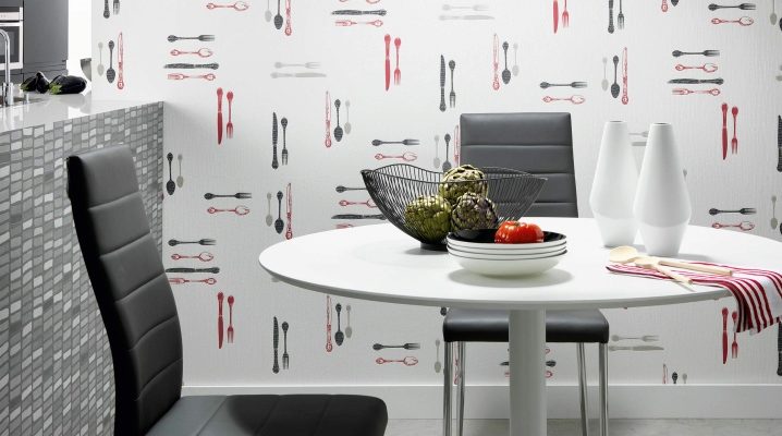
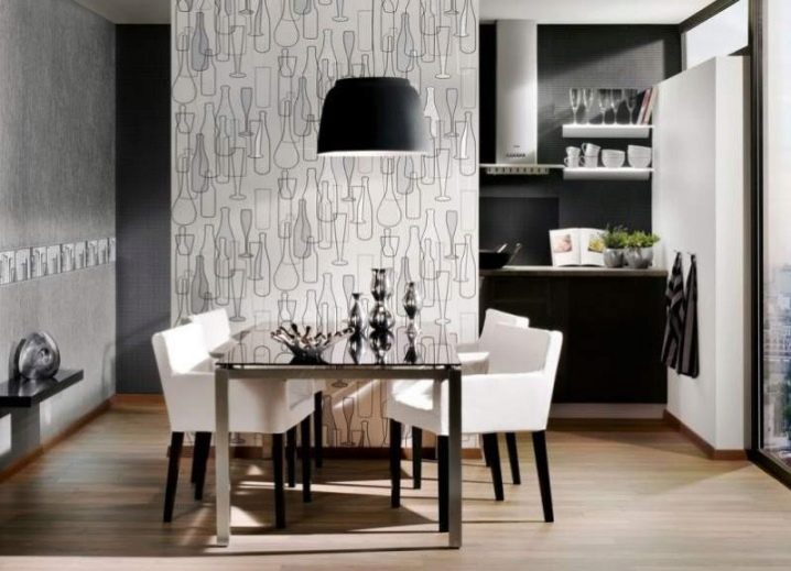
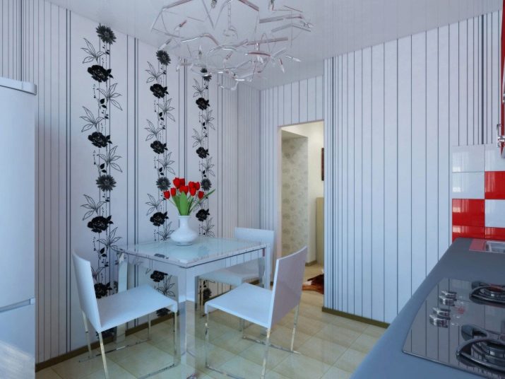
- The classic combination of white, black, gray. It can be used both completely in the interior and on one wall. If it seems boring, then revive using bright details, objects, textiles.
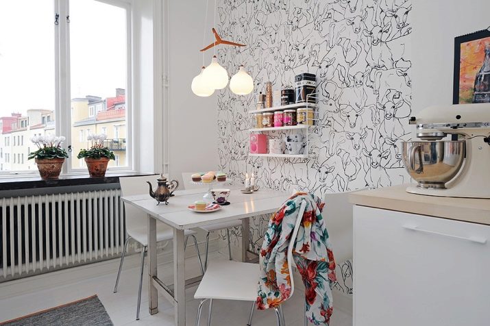
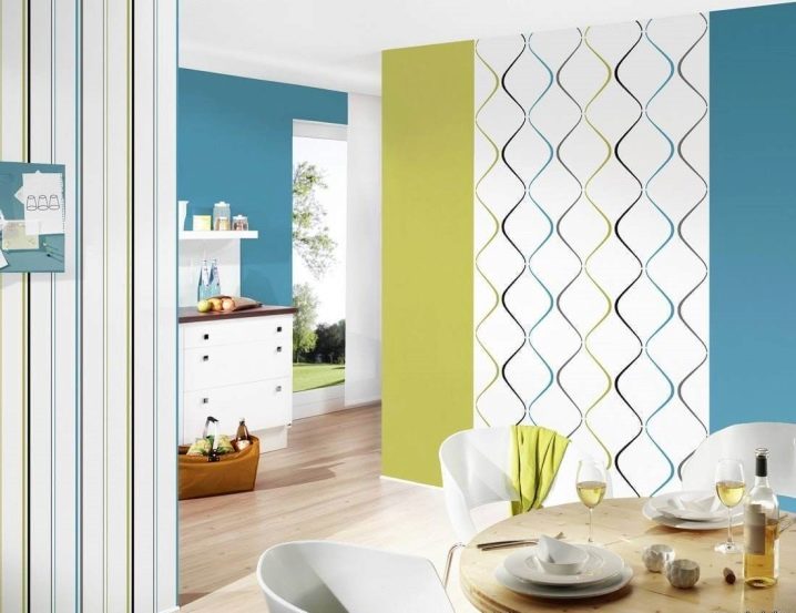
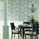
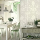
- It looks good union monophonic wallpaper with wallpaper with a pattern.
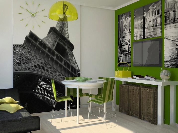
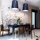
- The use of photo wallpaper is desirable in combination with non-striking wallpaper, so as not to overload the interior and not dissipate attention.
Types of wallpaper
To date, there is a wide variety of wallpaper on the material of manufacture, thickness and texture, coverage and functionality.In order not to get lost in the choice in the preparation of repairs, consider the most well-known and their advantages and disadvantages for the kitchen.
- Paper. The most familiar to us, available, representing the economy class. In addition to their pleasant low prices, they are environmentally friendly, unassuming, very diverse in color and pattern. But for the kitchen unsuitable. They can not be washed or even wiped, and to avoid pollution in the kitchen is very difficult, respectively, all this will remain on the wallpaper until the next repair. Although currently there are options for paper wallpaper with a thin vinyl coating, which makes this budget option more suitable for the kitchen.
- Vinyl. Beautiful, bright, practical. In case of contamination, such wallpaper can be wiped off, and if it is washable, it can also be washed. Their disadvantage is chemical origin. They are not breathable, in addition, they can produce not very useful substances. But for the kitchen, where constant ventilation is simply necessary, sticking such wallpaper is quite acceptable.
- Flizelinovye Wallpaper successfully combine the advantages of vinyl and paper. They are practical in use, as vinyl, but at the same time "breathe", do not emit harmful substances.In addition, they can be painted in a different color, which greatly simplifies and cheapens the process of changing the interior.
- Very successful in all respects an option for the kitchen - glass wallpaper. They are resistant to temperature, humidity, dirt, mold, fireproof. They are easy to glue and wash, they do not fade and do not lose their qualities for a long time. But, having such advantages, they have high cost. Glass fiber can be painted in other colors without compromising their texture and durability, thus, their cost can pay off over a longer period of operation.
- Liquid wallpaperconsisting of a glue composition with a filler made from cellulose, silk, viscose, cotton fibers, etc. The use of such wallpapers very successfully solves the problem of uneven walls, leaves no seams, has a wide choice of colors and combines well with other types of finishes. Liquid wallpaper is undesirable near sinks, because they are afraid of moisture.
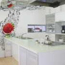
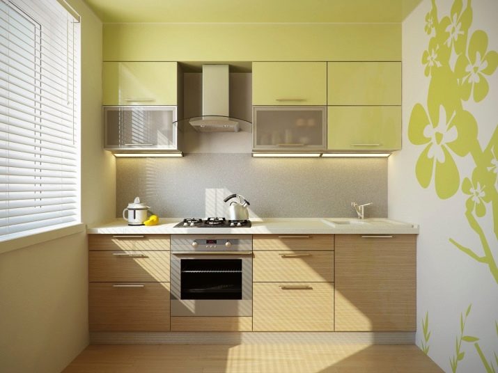
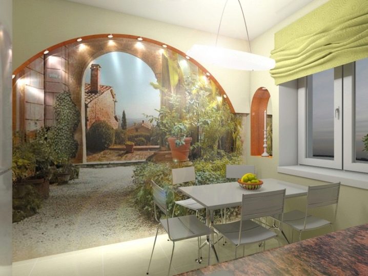
- Wall mural can play the role of the main focus in the interior of the kitchen. In addition, a well-chosen pattern of such wallpaper will push the boundaries of even a small kitchen and create the appearance of additional space.Panoramic pictures or photos with deep perspectives (paths, streets, various landscapes) can become such pictures.
- The use of a modern type of photo wallpaper is gaining popularity - 3D wallpaper. That is, wallpaper with a volumetric pattern. They cost significantly more than simple photo wallpaper, but are produced specifically for the kitchen, taking into account the strength and water resistance, and therefore they last longer. A three-dimensional drawing makes the kitchen unusual and adds space.
That is, a selection of wallpapers, and their combination among themselves will depend, first of all, on opportunities, imagination and goals. And to more accurately determine how to achieve these goals, consider the basic options for combining wallpaper.
Vertical combination
Vertical combination is a very good way to smooth the geometric flaws of the kitchen. Most successfully, it solves the problem of low ceilings and visual expansion of space in the kitchen-pencil case.
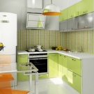
Here you can alternate monochrome contrasting stripes, and stripes with a pattern with monophonic stripes. In both cases, the vertical stripes will visually lift low ceilings.
Play carefully in contrasting colors to avoid aggressive combinations.
For a narrow and long kitchen, an asymmetrical way is more suitable when one wall has a combination of wide strips, while the others have wallpapers with strips of width wound. This design visually creates an image of a more square room. Another option to "expand" the kitchen will be the use of wallpaper shades of light on the long walls and dark on the short.
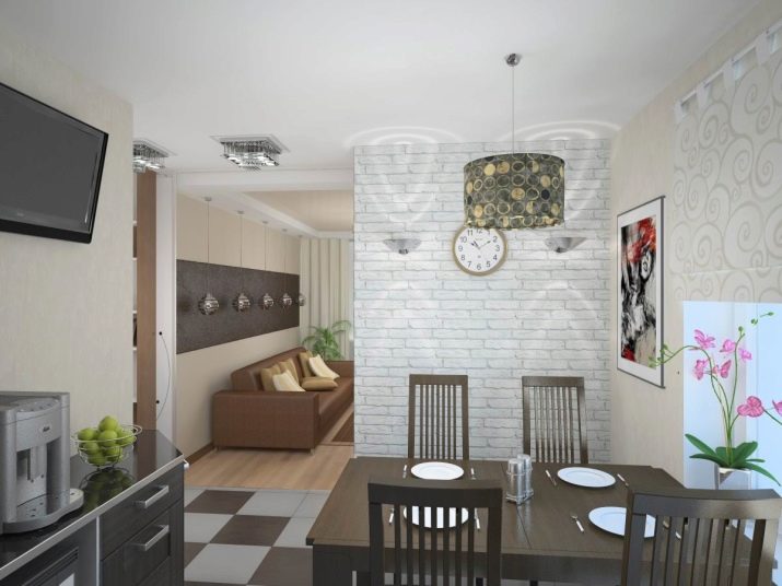
Vertical combination is also suitable for zoning a room when it is necessary to separate the kitchen from the seating area in the studio or select the dining area. It looks beautiful and has many design options. For example, the selection of the dining area in two lanes, or the creation of one wide strip for her. The use of contrasting vertical stripes in the presence of columns or vertical ventilation ducts looks striking.
But it must be remembered that vertical combination requires careful selection of wallpaper of the same thickness, so that the joints do not look sloppy.
Horizontal
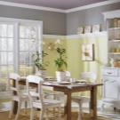
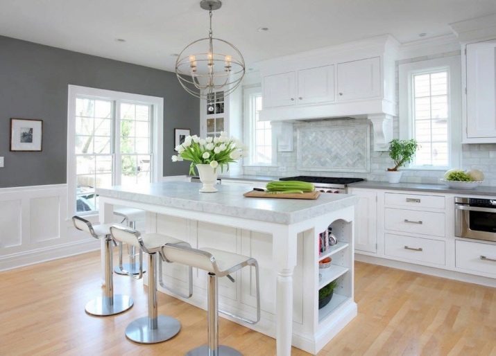
Another basic combination is horizontal. He is more familiar and familiar to us, because he is always present in any kitchen.This is a dividing line of countertops, plates, windowsills. And more often, it is common to divide the vertical space according to the level of the window sill. But in the case of high ceilings, division in the ratio of 1 to 2 looks more harmonious, where one part falls on the lower lane and two on the top.
Ideas horizontal zoning can be very diverse. This combination option will suit any kitchen, even in a small-sized "Khrushchev". It should not be forgotten that the small size will increase significantly if the whole interior is in dark colors. For a small kitchen, if the choice is made in favor of, for example, a brown headset, then a light top in beige, caramel colors will balance it. The lower band can be solved in darker colors, combined with furniture or have a geometric pattern.
Horizontal combination allows the use of wallpaper, which differ in texture. Here the difference in thickness is not fundamental, and the boundary line can also become an element of decor when using curbs, moldings, wooden slats.
As for combinations, it is customary to choose:
For the upper part the wallpaper is of lighter tones; if a wallpaper with a pattern is chosen, then preferably a larger pattern should be placed in the lower part, and the top should be decorated with wallpaper with a small pattern. Looks elegant combination of wallpaper, made in the same range of colors.
Very aristocratic, like English living rooms, looks like a combination of wallpaper with the bottom of wood panels. Now, instead of wood, it is popular to use for panels and materials such as cork wallpaper or bamboo.
In conclusion, we can say that for people with experience in design, there are still many more unusual options, such as accentuating one wall, patchwork method (patchwork), stepwise and wavy pasting. And the rules of combining, rather, not the law, but only recommendations. Ultimately, everything will be determined by the desire and imagination of the author.
