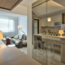
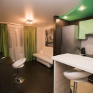
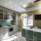
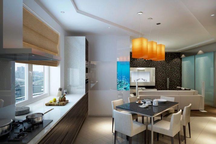
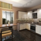
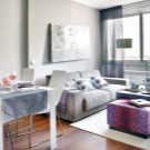
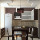
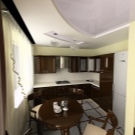
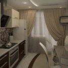
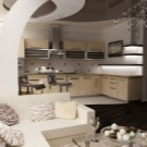
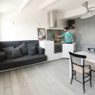
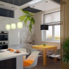
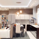
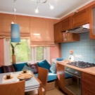
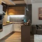
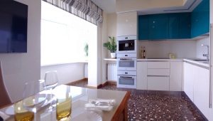
Design kitchen-living room of 20 square meters. m
Modern ideas of planning 2018: examples
In the modern metropolis, residents are accustomed to the comfortable and functional space of apartments. Housing planning has become a daunting task for architects who have had to take into account many factors, such as budget, ergonomics, modern fast lifestyle. Modern planning increasingly unites any zones. This happens not only in studios, but also in apartments with several rooms. For example, the combination of living room and hallway or living room and bedroom area, the most common layout, where the combined kitchen and living area.
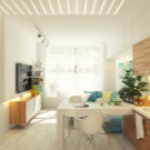
Planning a kitchen-living room of 19-20 square meters. meters allows functionally correctly and ergonomically accommodate two zones, plus creates the impression of greater freedom of space. This layout is often found in the ready-made version, but can also be carried out independently, in consultation with the relevant authorities.
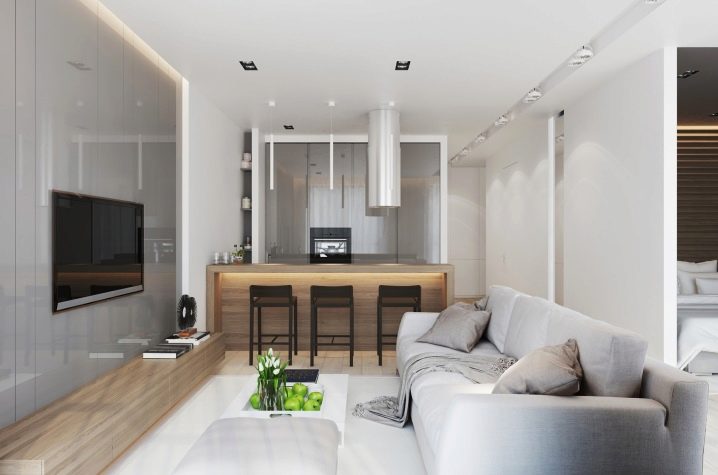
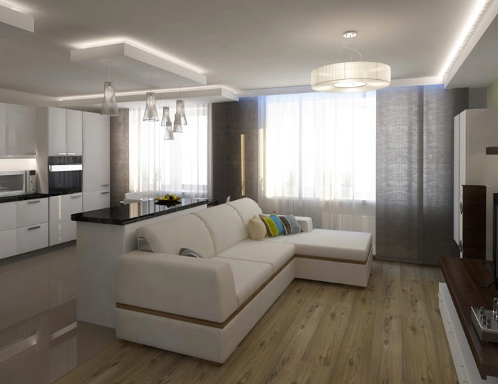
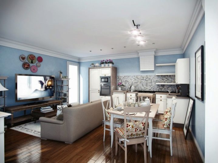
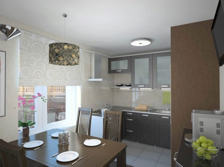
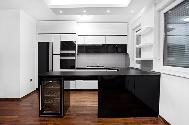
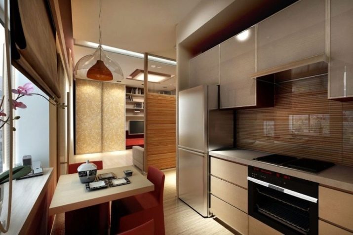
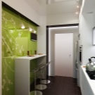
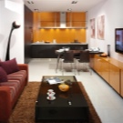
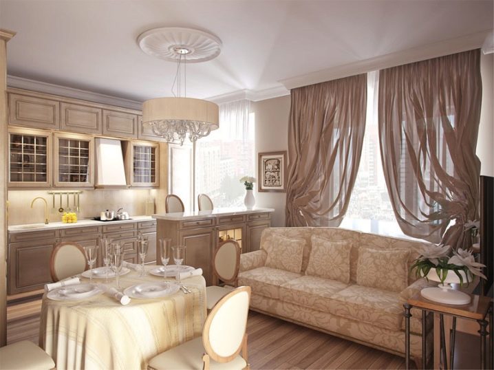
One of the options for planning the kitchen-living room - parallel. This solution will fit perfectly into a rectangular room and at the same time leave free space in the middle of the room. On one side is the working space of the kitchen, and on the parallel - a recreation area. Often these layouts complement the “island” - an element of space zoning, it can be a bar counter, a soft sofa, a fireplace, or the same work surface with a sink. Such plans are called island.
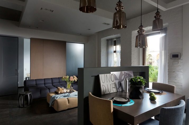
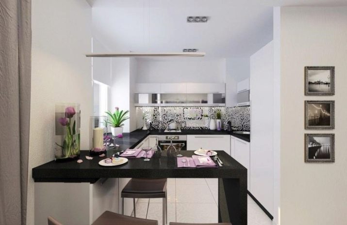
The U-shaped layout is similar to the parallel one, but can be applied both to the kitchen layout and to the arrangement of the kitchen-living room. For example, having arranged a working surface and a recreation area on parallel sides, in an additional section you can place a dining area in the form of a table or a bar counter with chairs. In another case, one of the parallel surfaces is not adjacent to the wall, but is a screen-partition for the combined living room area.
The modern plan of apartments sometimes involves non-standard or asymmetrical layouts. Furniture and work surfaces in such rooms are often located around the perimeter, which resembles a U-shaped layout.
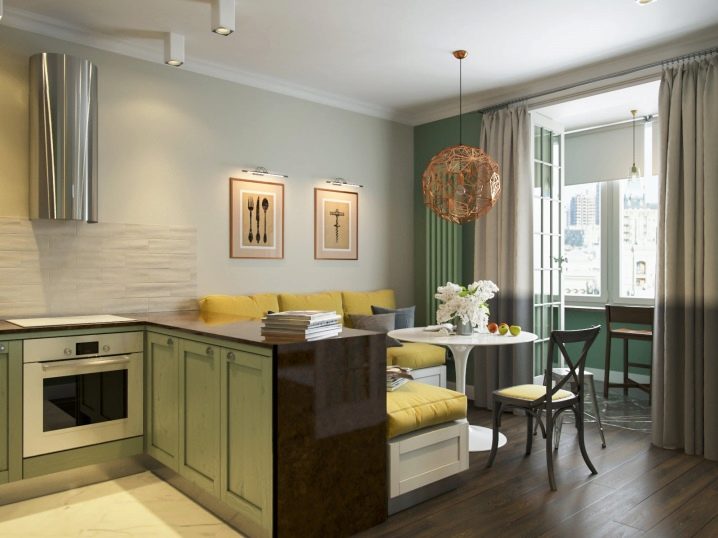
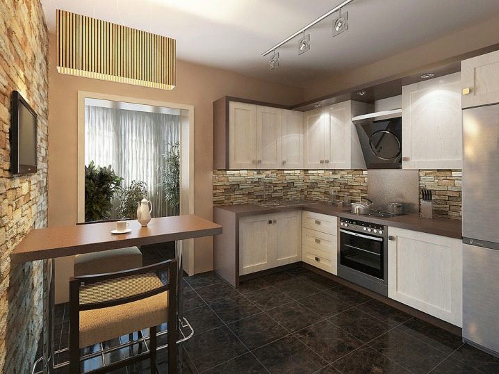
Another example - L-shaped layout, perfect for rooms of square shape. The whole cooking surface can be complemented by a dining table or bar counter. In this embodiment, the living area is better placed parallel to the work surface.
Interior zoning
The lion's share of effort should be given to the zoning of the kitchen-living room. Here are some examples of comfortable integration:
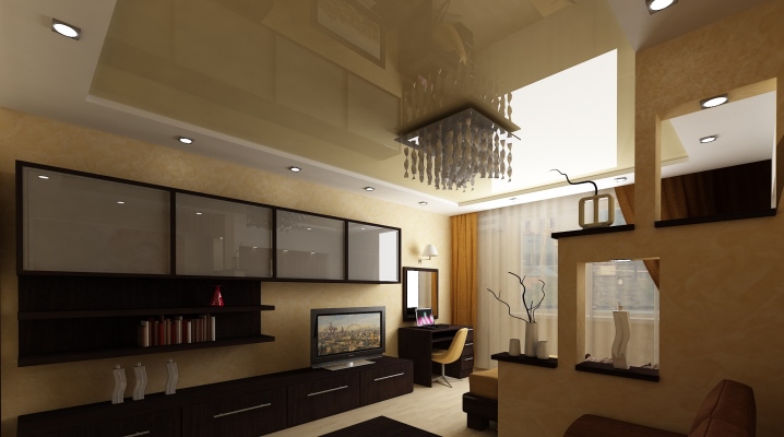
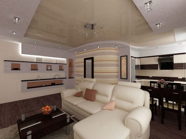
- Installation of partitions of various materials. Most often, this option assumes a plasterboard construction that separates the zones from the floor to the middle of the height of the wall or from the floor to the ceiling. The second option can be used as a basis for mounting pictures, shelves, TV or memorable photos within. You can experiment and betray the design of an unusual shape or make it through.
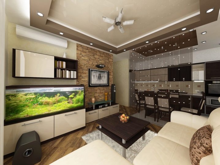
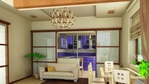
- Sliding partitions. This design option is more mobile and, if necessary, will allow to separate the kitchen and living room. To make this design not look "hard" you can use stained glass or plain matte, well-chosen color and pattern can be a real decoration of the interior.
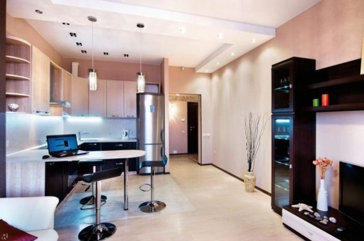
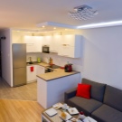
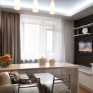
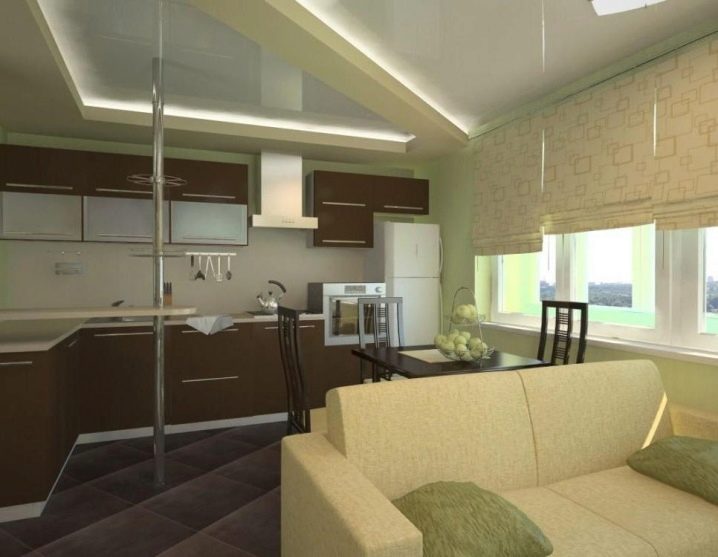
- Bar counter.Modern and trendy piece of furniture will fit well into the interior. A sufficiently wide surface of the rack can be a substitute for a dining table.
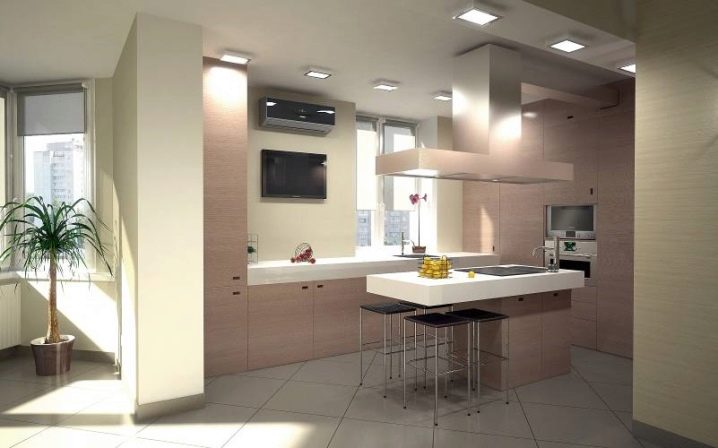
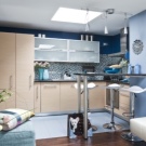
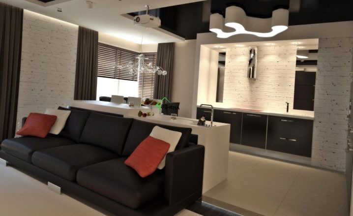
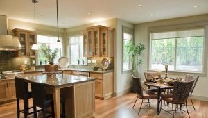
- Island layout. Visually divide the space will help the working surface of the kitchen. Hob and sink, strictly selected for the interior, will organically fit into the space. But with such a plan should observe the immaculate cleanliness of the kitchen. This placement is suitable only for rooms with a size of 20 square meters. meters, otherwise it will not create special amenities.
- Contrasting finish. Often used technique will allow to experiment with a color palette, textures and materials. Such a technique will allow you to avoid large structures, it is enough to highlight the central zone with a bright color of wallpaper or paint applied to the textured plaster; a good solution will be photo wallpaper. Complement the rest of the interior with matching color or texture accessories, or kitchen utensils. Do not forget about the reasonable use of contrasts.
- Shine. Placing the ceiling or wall lamps on the border of functional areas, you can easily divide the space.Experiment with the arrangement of light in the zones themselves, select each according to the features of ergonomics.
- Furniture. A cozy large sofa, turned back to the kitchen, will allow you to rationally separate it from the living room. It will also look good wooden rack, complemented by decorative items in the form of vases, boxes, frames with photos.
Design nuances
Good design is designed to make a person's life better and more pleasant. This design takes into account many subtleties that save time, keep a good mood and increase functionality. To correctly combine the space of the living room and the kitchen should be aware of some of the nuances.
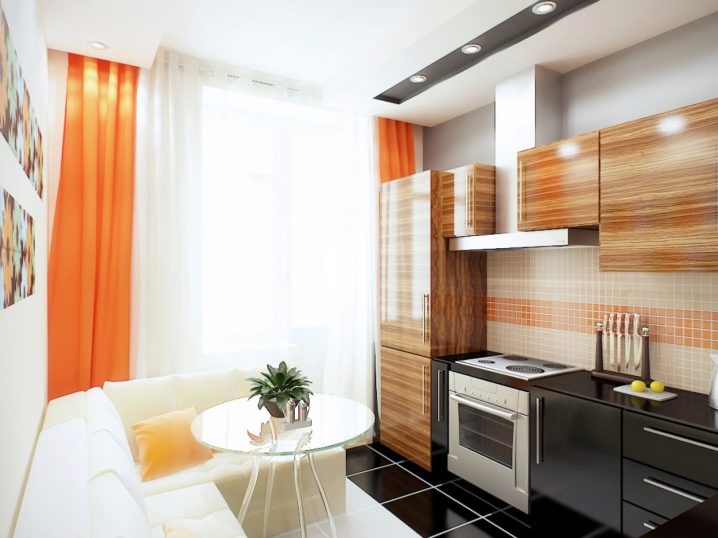
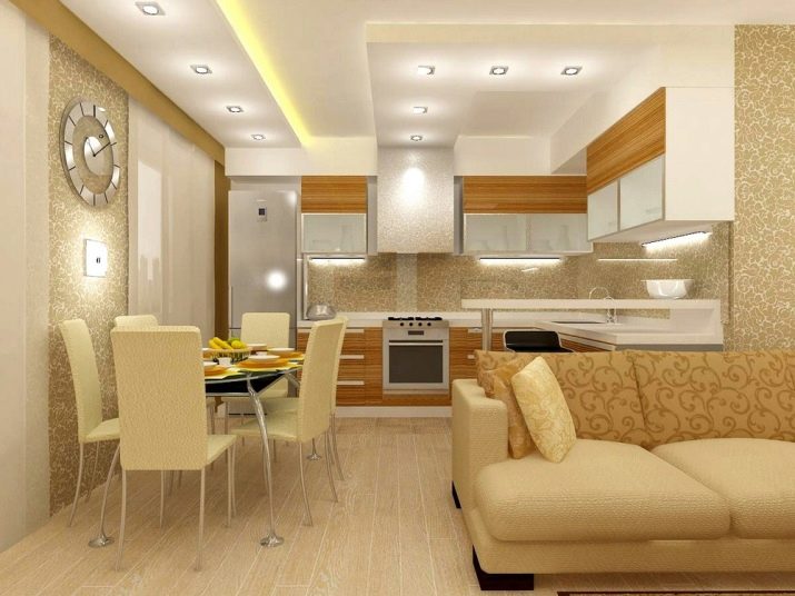
For the kitchen-living room area of approximately 20 square meters. meters you should not use a lot of dark colors: black, dark shades of brown, purple, blue. This visually reduces the space. Shades of blue, beige, yellow, warm green, on the contrary, will make the room more spacious. Warm shades will make the room cozier and lighter.
The selection of equipment in this case is very important. Be sure to install the hood, so smells from the kitchen will penetrate less into the living room.You should not choose a very noisy hood, it is not always convenient when receiving guests in the late hours when you want to relax. This also applies to the rest of the equipment. An excellent stylistic decision will be a technique made in the same or similar style material, because In the kitchen-living room, many electrical appliances will be in plain sight.
Furniture also absorbs the smell of cooking. Easily washable fabrics will be a good solution and will allow for better cleaning. Curtains, tablecloths and all other textile elements should be combined in density, color and quality. This does not mean that it is necessary to stop the choice only in one color, use the combined combinations of shades.
Much attention in the project designers pay lighting. In the case of a combination of living room and kitchen, one light source may not be enough. Dot functional fixtures are well suited for work surfaces, floor lamps and sconces will create a cozy atmosphere in the living room area, and it is better to light up the dining area with a bright chandelier.
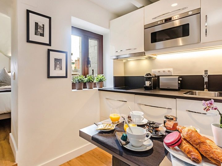
For the most convenient design of the kitchen area, there is a working triangle rule.This means that the area is divided into three main areas: cooker-cooking, refrigerator-food storage and sink-washing dishes. The fewer obstacles and transitions from one point to another, the more functional the room.
For a rectangular kitchen
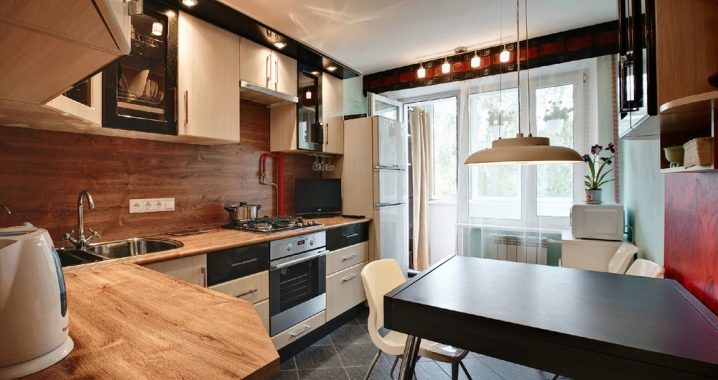
The peninsular, island and U-shaped layout is perfect for rectangular rooms with an area of 19-20 square meters. One of the parallel sides in the example of the U-shaped layout can be made in the form of a bar or work surface, which will serve as a transition to the living area.
Island planning will give more freedom to move and experiment. In this case, the combined layout allows you to build a “work triangle” and continue to communicate with guests and family while cooking. When choosing a hob and sink as an island, it will be difficult to transfer the water supply and hold a gas hose.
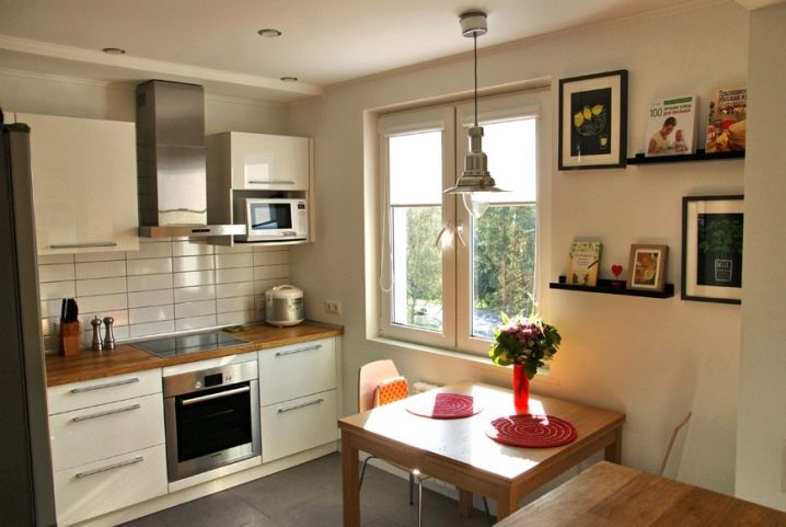
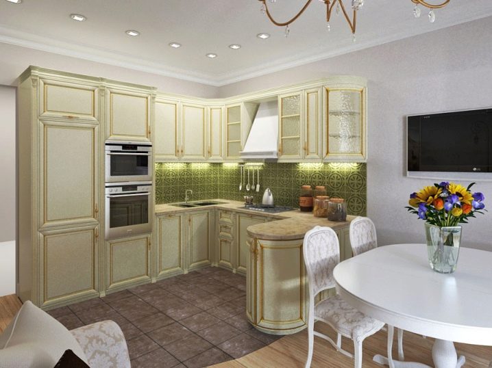
A good option would be the angular layout. This arrangement leaves enough space for the dining and living area. In the corner of the working surface the sink fits perfectly together with a spacious wardrobe.
If the rectangular room is too narrow for visual expansion, you can use:
- Elements of mirrors. Mirrors continue in the space of the opposite interior. Mirrors opposite each other and large floor-to-ceiling mirrors have a special effect.
- 3D wallpaper. High-quality samples of 3D wallpaper will create the illusion of being in a picture, which interestingly expands the space.
- Glossy facades of furniture. Lacquered or glazed facades serve as mirrors.
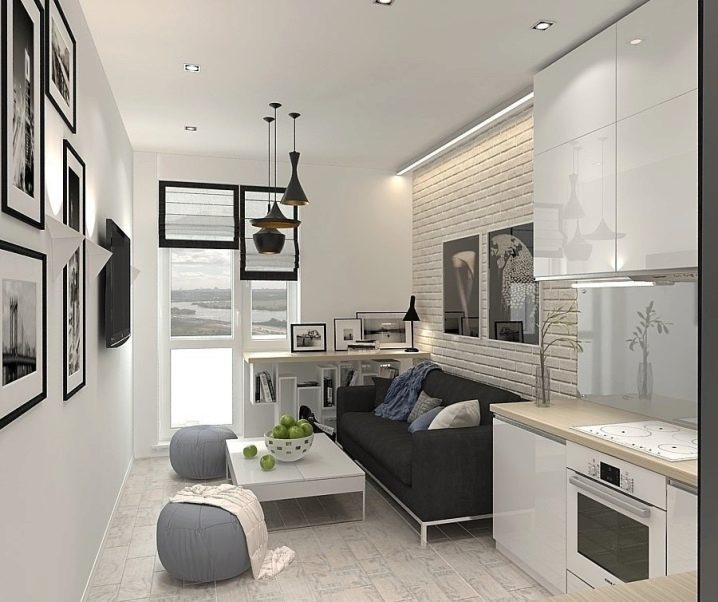
- Light color range. Light colors, unlike dark ones, have the ability to emit light, thanks to this optical deception the eye recognizes such objects as larger ones.
An excellent solution to zoning will be sliding partitions, this option is suitable for families with children. Adults can quietly chat in the kitchen while children watch TV or play in the living room. With a peninsular layout, a bar counter with chairs will fit in well.
To be placed in a square
For rooms of square shape suitable angular layout and U-shaped. This placement leaves space in the middle of the room, there can fit a fluffy carpet or a round dining table.It is worth considering that the U-shaped layout of the rooms does not imply a balcony. In an area of 20 square meters. meters and more you can experiment with the island layout.
In a square room, if you choose an island layout, it is better to make the island square or round, in which case the location becomes much more functional. The island is always located at a distance of 100 cm from any other furniture, an area of 20 square meters. m is quite enough.
So that the space in such an interior does not seem “crammed”, you can choose furniture and headsets of light shades or replace wall cabinets with shelves.
What is not recommended
In order for the repair to succeed, it is worthwhile to carefully consider the rules of competent design and avoid common mistakes.
Combined rooms are not always provided for by the building and in case of redevelopment it is worth coordinating repair actions with a special service. Demolition of the bearing wall is very dangerous and can lead to serious destruction of the house.
Do not abandon the zoning of the room. Visual separation will make the space more interesting and functional.Stationary or mobile partitions can be a real highlight of the interior.
Particular attention should be paid to the hygiene of the room. The kitchen is the most frequently cleaned area. When combining the living room and kitchen areas it is worth remembering that cleaning only one of them is impossible. It is not necessary to choose unnecessarily capricious, light and absorbent material for upholstered furniture. A powerful hood will not allow odors to spread, and the smooth surface of the working area of the kitchen is easy to clean.
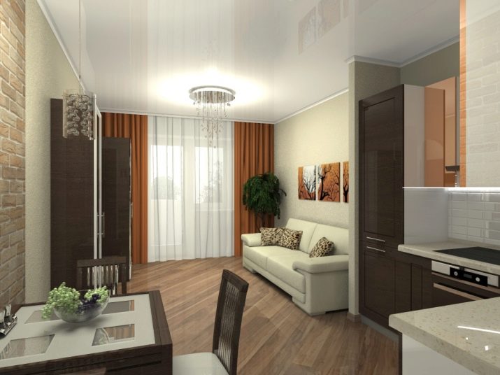
A mistake would be using the same floor covering. For the kitchen more suitable tile, and for dining or living areas - laminate or parquet.
It is not recommended to use only one light source. Lack of lighting spoils the eyesight, may cause drowsiness. Warm and cozy atmosphere in the living room will create floor lamps with a soft light, in the dining area it will be more convenient to have overhead lighting, and special attention should be paid to the working area.
To the combined zones look harmonious, you should not use different styles for their design. This rule applies to color: the combination of colors should be harmonious, suitable for artificial and natural lighting.The only exception is white, with which any color can be combined.
