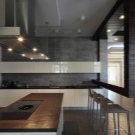
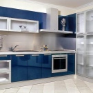
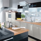
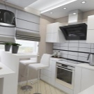
Apron and kitchen color combinations
Special features
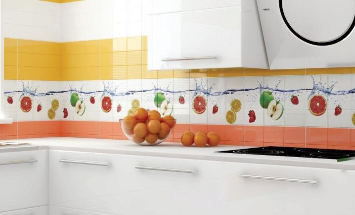
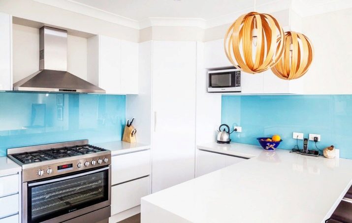
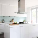
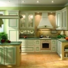
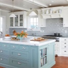
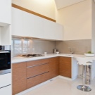
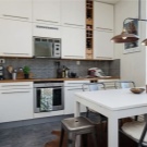
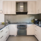
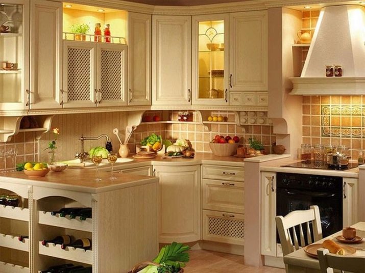
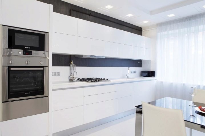
Bright kitchen - the dream of almost any hostess. This is a very fashionable, fresh and in its own way a bright design decision. The kitchen room with light walls seems more spacious, thanks to this finish it becomes more visually. That is why a white kitchen with a bright accent in the apron part is ideal for a small kitchenette. In addition, the white color in the interior of a house or apartment is always relevant and will never cease to be fashionable.
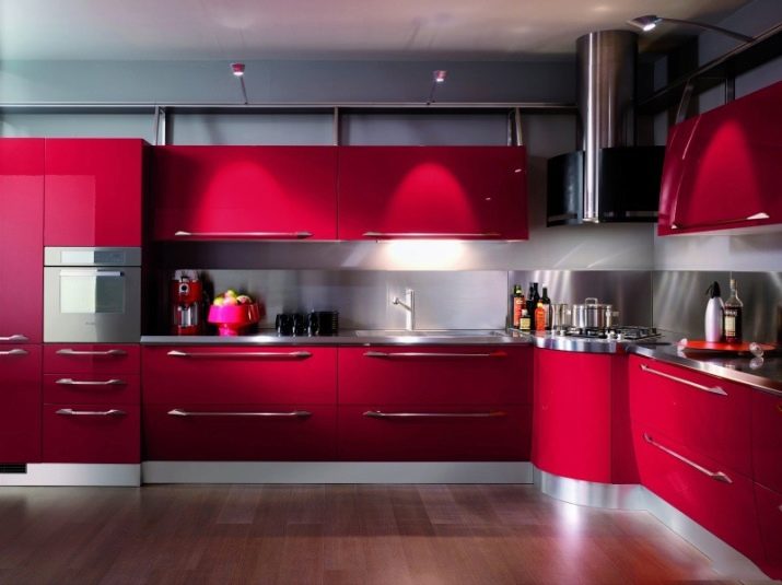
In order to diversify the design of the bright kitchen, you need to choose a bright apron, the main thing is a skillful combination of colors. The working area will be a rich contrasting spot, a highlight of the entire room. The main feature of this design is that it is very stylish and versatile. It is perfect for both modern and classical kitchen interior design. A light color scheme with a contrasting finish of the working area will perfectly fit into the interior in the style of high-tech, classic, modern, Provence, as well as complement the Scandinavian and maritime style.
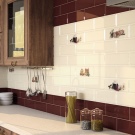
The apron area should be made even brighter because it is convenient from a practical point of view. The workplace of dark or saturated color is easier to wash and clean. It is not as visible traces of spray or specks that can form during cooking. The versatility of the white finish is also manifested in the fact that you can safely change all the kitchen furniture to a new one without making repairs, since this shade will suit any headset.
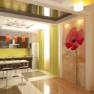
There is one trick for those who do not want to do repairs, but want to somehow update the interior. In this case, you can purchase special stickers that will unusually color monochrome walls and diversify the design. These stickers can only highlight the apron. An interesting solution would be to glue up this part of the room with contrasting images of red roses or yellow tulips.
Color Design Ideas
Apron for classic white kitchen maybe almost anything. The most important thing is to respect its harmony with the rest of the interior. In addition, this functional part should be framed practical. That is why many designers advise to give preference when itfinishing ceramic tiles.
When making an apron area, it should be borne in mind that the method of its design should be reliable. The material chosen for finishing this area should not be exposed to high temperatures, since it is this part of the kitchen that is characterized by high humidity and high temperature. Due to the influence of these factors, poor-quality building materials in the apron area can be deformed, and the pattern on it can be broken, its color can change. Therefore, choose only high-quality finishing materials with a sustainable way of applying paint and drawing.
The tile happens to a glossy or opaque surface, with the smooth or with the relief invoice. For a glossy kitchen, you can pick up the matt frosted part that stands out. There are many interesting solutions.
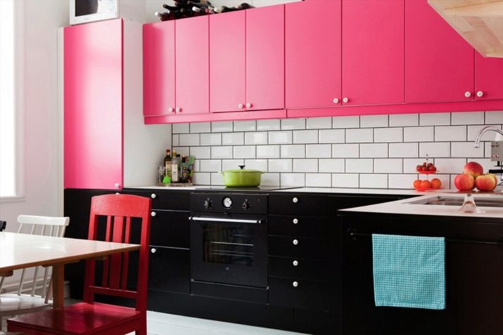
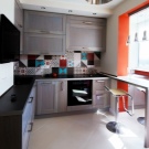
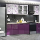
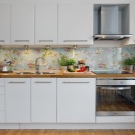
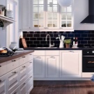
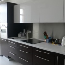
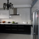
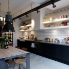
Currently, there are many interesting design ideas for the decoration of such a functional part. It can be a contrasting design, such as a white top-black bottom, or it is possible to install a bright 3D-image tile in this part of the kitchen. This design will be a bright focus on the bright kitchen.You can brightly decorate the apron area with tiles with floral patterns, for example, with the image of large roses or small lilac flowers.
If you want to somehow separate the apron, but do not plan to change the colors of the kitchen as a whole, you can play on the contrast of the finishing of the entire kitchen and the apron. So, we can give the following examples: we decorate the entire room with a finishing material with a print on which small details will be dark, and the background will be light, and the apron part will be tiled or wallpaper with a dark background and a similar light pattern. There are other options: it is possible to arrange the drawing in the apron area vertically, and in other areas horizontally. This is a very unusual and stylish design solution.
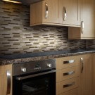
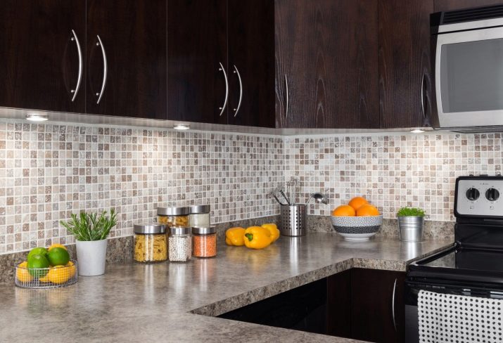
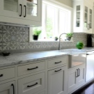
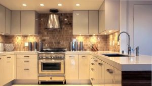
You can also arrange the area of the apron in more restrained strict colors. This zone can be distinguished with the help of an unusual bas-relief or with the help of an old-style design. For this perfect tile designed with natural stone or marble. It is important to select the design of this part of the room to the kitchen. The bright marble corner will look great on the background of the bright kitchen.
Another interesting idea is the opposite design of the kitchen room.So, it is possible to make all the walls bright and saturated or, on the contrary, dark, but catchy. The apron part in this case will need to be made very light or perfectly white. Such a bright spot will look stylish and modern. This is an ideal kitchen zoning option.
Wall panels
Wall panels for the kitchen can be made of materials such as glass and plastic. Glass panels can imitate any material, they are distinguished by a variety of colors. You can pick up monochrome panels of glass or, conversely, colored. The widest choice of plastic panels, they are presented in the most vivid and unusual colors that interestingly diversify and color the interior of the bright kitchen.
Classic style
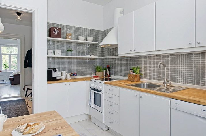
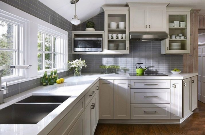
For a classic interior, it is more typical to use pastel shades; here it is better to avoid catchy contrasting combinations, such as red-white and others. It is better to supplement the bright room with a working area. in gray tones They will perfectly fit into such an interior, they will look stylish and add peace of mind to the design.For the gray-white kitchen is perfect ceramic tile in the working area marble pattern. The decor will fit very well with a gray stone. A more vivid and unusual classical solution will be the Baroque design, which is a variation of the classical trend.
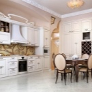
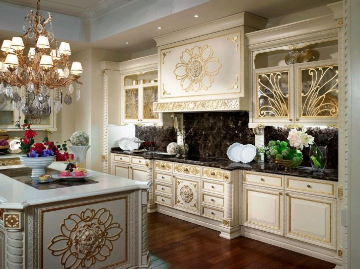
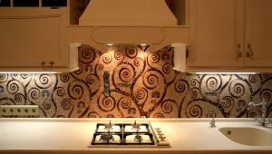
Classic Kitchen Apron baroque can be decorated with white tiles with patterned paintings. It is just the way in this interior glass panels will fall. To a white kitchen set it would be better to make walls with golden drawings and paintings. Such a pattern can be made both matte and glossy. The work area looks great, decorated with a mosaic in gold tones, because it fits perfectly to light walls and looks luxurious.
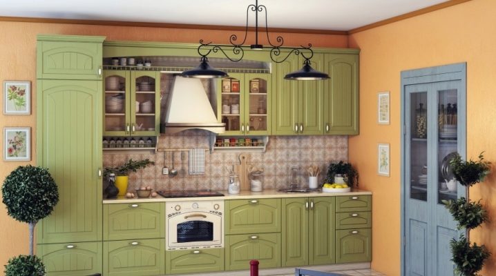
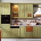
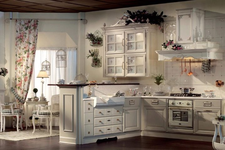
For a bright kitchen area Provence style it is better to use a combination of white with pale pink, beige, light blue and other pastel tones. You can decorate the working area with artificially aged materials in order to better fit into such an interior.
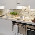
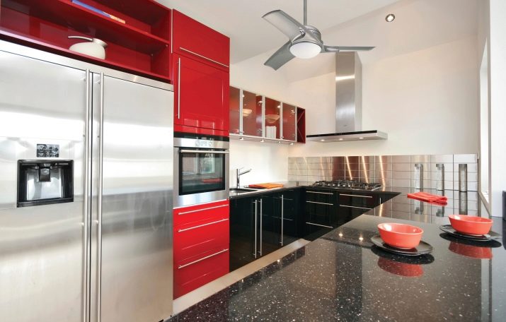
For country style or for the English design is better to use brighter combinations. Here you can use brick color, red or black.You can arrange the work area material with imitation brickwork. This idea is perfect for light kitchen, and for the dark. With this design, combinations of red and white or black and white colors are welcome.
Country-style can be supplemented with images of plant drawings on the walls. Such decoration of functional areas will bring comfort to your home. The soft and smooth lines separating the apron and the rest of the room look very nice.
Modern style
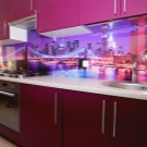
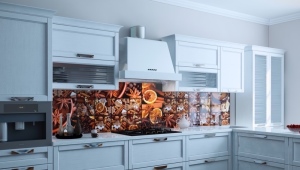
For modern areas is characterized by the use of bright and unusual colorful combinations of colors. For kitchen decoration in modern style, you can make all the walls light, and decorate the working side with a bright glossy color. A great solution would be to use photo printing. Gloss - an integral part of modern style. It further enlivens the bright colors.
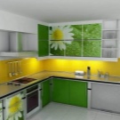
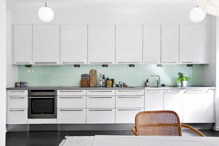
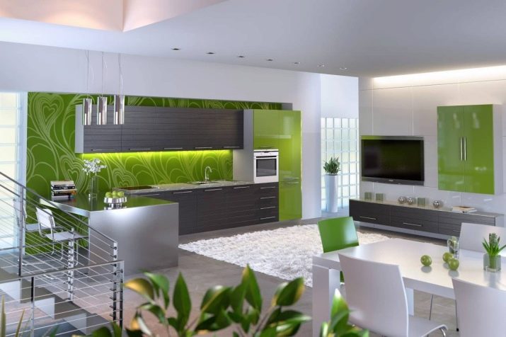
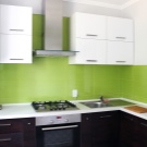
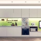
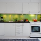
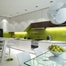
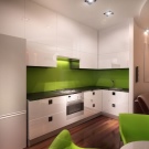
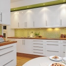
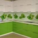
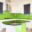
White kitchen with light green apron looks very stylish and modern. Even more juicy will look like a combination of white and lemon with a glossy sheen for the design of the working area. Such bright surfaces are better decorated with glass.
Another modern stylistic direction - minimalism in the interior of the kitchen. As a rule, this is a fairly simple and neutral style that can be created using a combination of no more than two or three colors. It would be best to arrange the room in this style in white, and the apron to highlight a rich shade. The working area in this case is better to finish with matte monophonic materials. Pictures and images on the walls of the kitchen in a minimalist style are not welcome.
Another interesting solution will be the design of the kitchen. in techno style. In this case, the colors will need to be combined as follows. The working area must be decorated with transparent glass with a matte finish or gray metallic tile of metallic color. The combination of metallic color kitchen apron with white walls looks very original. To finish such a kitchen, you can use iron elements of decor.
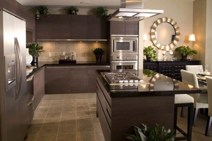
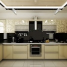
For modern kitchens with stylish built-in appliances ideally take place. hi-tech style. In this case, you should combine and combine dull shades from the same color range. It is better to arrange the apron and the tabletop with the same finishing materials, it is desirable that their color should also be identical.For such an interior is perfect black and white working area and a similar working surface of the table.
The interior in the high-tech direction can be created with the help of matte photo printing on the working part of the kitchen. And you can choose a variety of abstract images. The remaining walls should be made monochrome with light gray or just white.
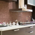
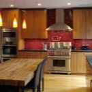
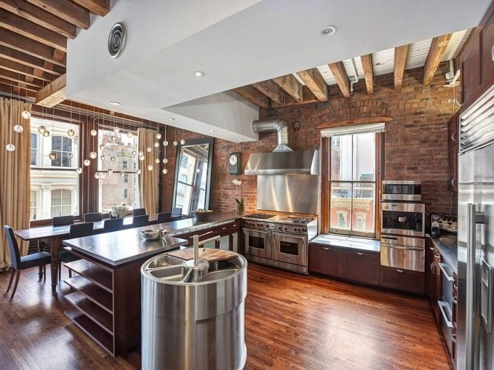
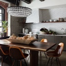
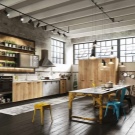
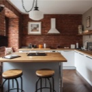
Now among the designers is very relevant loft style. To finish the kitchen in this direction, it is better to prefer the imitation of masonry in the apron area. This is a great design solution for a white and brown kitchen. The main walls can be made white monochromatic, as well as beige or dirty-gray, for example, a discreet ornament, and an apron can be decorated with panels or tiles of coffee, classic brown, auburn or monochromatic red-brick color. When you design a working area in the loft style, you can not be afraid of bright colors, it is better to give preference to materials with a relief texture or with a rough structure.
