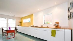
Kitchen design without overhead cabinets
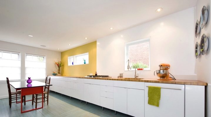
If you want the kitchen to have as much “air” as possible, you can refuse the part of the furniture so familiar to our mentality. Namely - remove the upper tier of cabinets. Storage system will have to think carefully, but the design of the kitchen without the top wall cabinets will be your special pride.
Features and benefits
Single-tier kitchen make for beauty! Functionality and convenience in this case are relegated to the background. This is the case when the owners know how to treat things carefully, have only the minimum necessary utensils and do not save tons of food.
Of course, such a solution has its advantages and disadvantages. Single tier set:
- Leaves a lot of space in the room. If the kitchen is small, this furniture will fit very well;
- allows you to have a very bright work surface, because the shadow of the upper cabinets does not fall on it;
- It is considered safer, becausethere are no loaded hanging elements in it, but in order to get food or dishes, even children do not need ladders and chairs.
- It looks original and fresh: after all, a kitchen without top cabinets in Russia is quite a rare thing.
Among the shortcomings can be noted:
- Place in this headset a lot of things will not work;
- part of the dishes or products will be visible - you will have to maintain perfect order;
- to get things out of the cabinets, you have to constantly bend down;
- the depth of the floor cabinets will be large enough - this is not the most convenient option in practice;
- Potentially useful areas will have to be left vacant - an unaffordable luxury for most modern apartments.
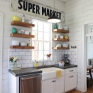
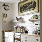
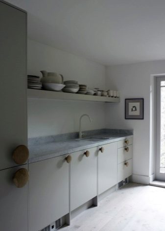
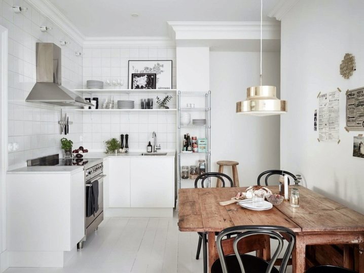
Upper walls free from cabinets fit very well into modern minimalist styles, high-tech, industrial, loft or romantic Provence, scandi. Usually from the hanging furniture refuse in favor of an unusual decor of the walls or original decorations. Free walls are well suited if a combined kitchen-living room is planned: its appearance will delight the eye of guests and households.
Single-tier kitchen set, most likely, will have to do to order. And this is a great chance to think through the inner filling of the lockers to the smallest detail.
Layout options
Kitchen without wall cabinets is suitable for both small and large premises. True, in the first case, a single-tiered headset will be designed to save space and not “eat” the light in the apartment. But for a large kitchen - this is a way to show your design abilities and create an amazing, stylish interior.
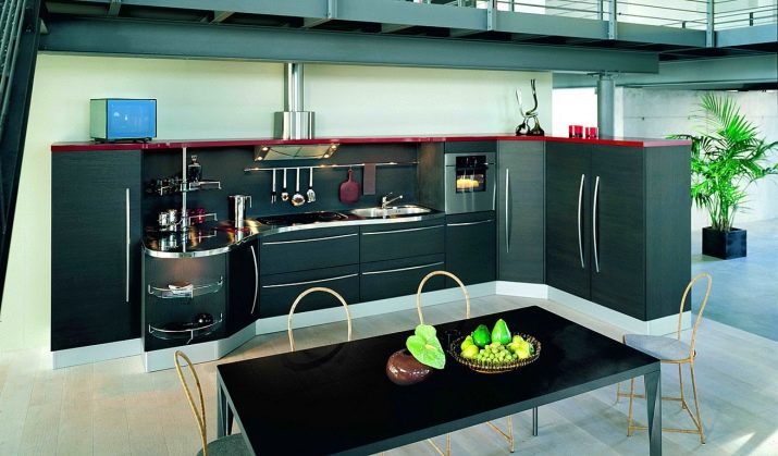
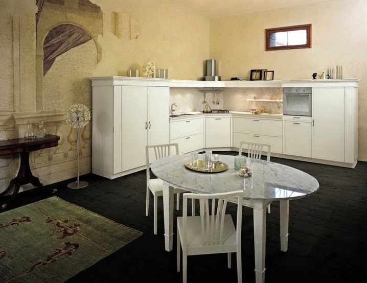
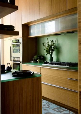
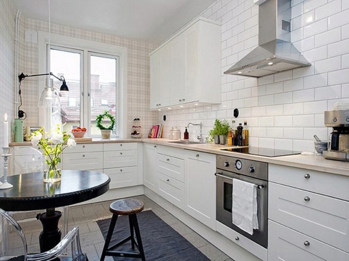
So, for a small kitchen perfect linear and angular layout. With linear - lower cabinets are arranged in a row against the wall under the same tabletop. There should be a place for the work surface, sink and plate.
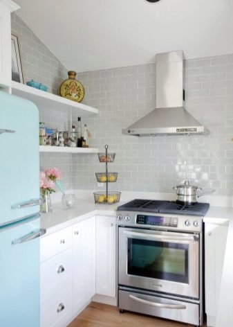
The angular location of the cabinets involves the construction of their letter "G". At the top of the corner there is usually a sink, and on either side of it is a cooking surface.
In both types of planning, it makes sense to supplement the furnishing with a sideboard, cupboard or narrow long cabinet, which is commonly called a “pencil box”. You can put it in the corner, or you can put it on the wall opposite to the headset. First, it will create additional storage space.Secondly, it will add a height difference in the interior - it looks interesting. And thirdly, such a cabinet can “make” your style: in particular, a classic buffet with artificially aged surfaces is an indispensable attribute for a Provence style kitchen. A case with a mirror metallic coating will bring the interior closer to “high-current”, etc.
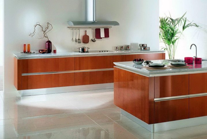
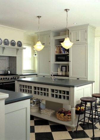
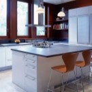
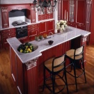
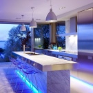
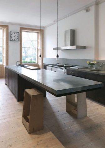
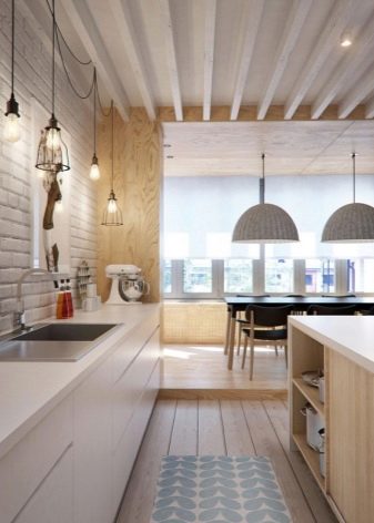
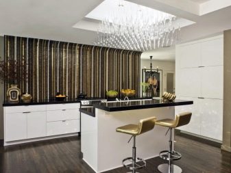
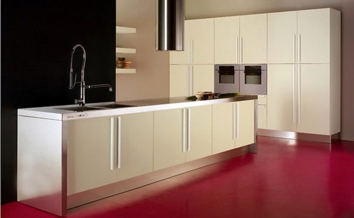
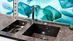
If the squares allow, you can put a single-tier suite with the "island". The island can serve as a table, but here its main destination will be - additional storage space. By the way, not only cabinets can be inside it. There you can embed a technique (for example, a dishwasher) or even a sink.
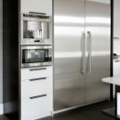
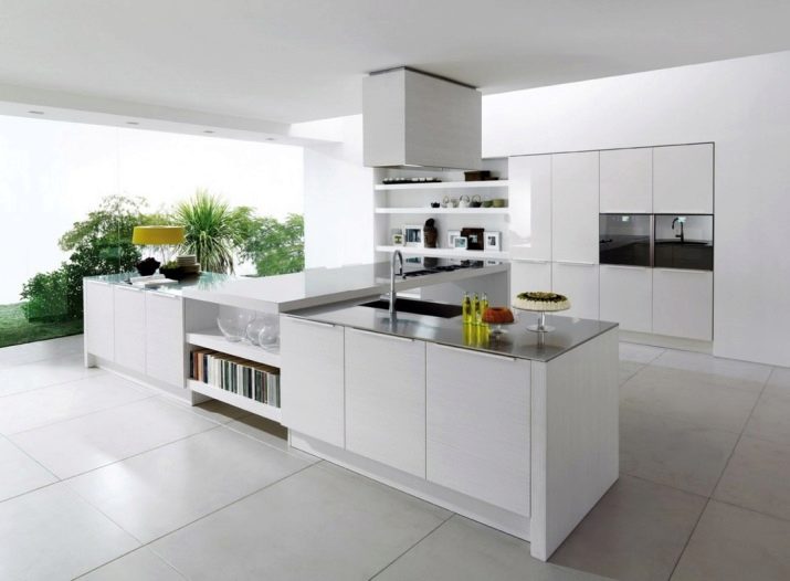
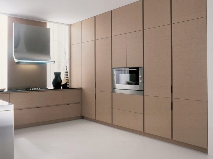
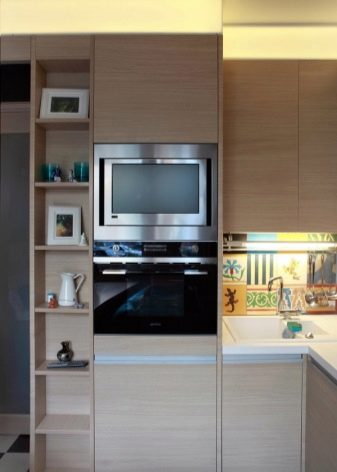
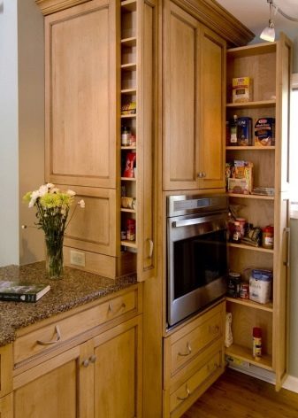
With the "island" layout there is another interesting design solution - a kitchen with cupboards, columns. That is, the usual low kitchen cabinets are replaced by high and long. They can occupy the entire wall. Ideally, column cabinets are located in a niche - i.e. Do not protrude beyond the wall level. All household appliances are built in them - an oven, a microwave, the dishwasher, etc. And the working surface is located on the island.
The table should be long enough.With such a layout, it is possible to arrange the cooking surface at one end, then the working table and at the other end the sink. Such solutions can often be seen in culinary television shows (everything is washed, cut and sent to the stove in almost the same place) or in open kitchens in restaurants.
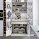
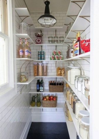
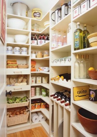
Ideally, if the kitchen is adjacent to the pantry or have the opportunity to arrange it. There you can store stocks of groceries, spices, part of the dishes.
What to do with the walls
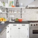
With all the modern minimalism, the walls can not be completely empty. It is proved that with a quick glance at the kitchen, a person first of all draws attention to the place where the kitchen “apron” is usually located (which is why designers often make it the dominant stylistic style). In a situation with a single-tier set there are two ways out: decorating the walls or placing at least some storage systems on it. You can successfully combine these two things and make a few shelves, placing on them only decorative gizmos.
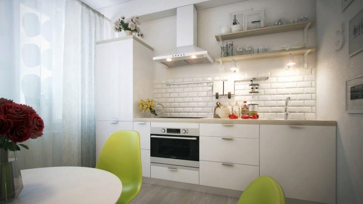
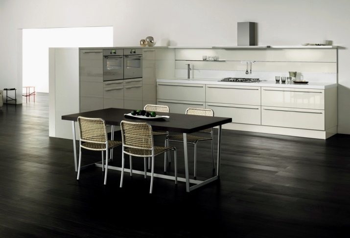
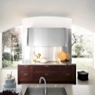
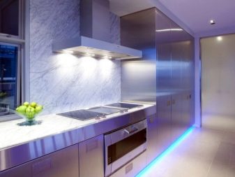
If the kitchen is not too large (for example, its area is 9 sq.m.), and the furniture line is not too long, you can get by with a “bare” wall.The metal hood on a perfectly smooth and well-finished light wall will perfectly fit into the high-tech style and other "minimalistic" directions.
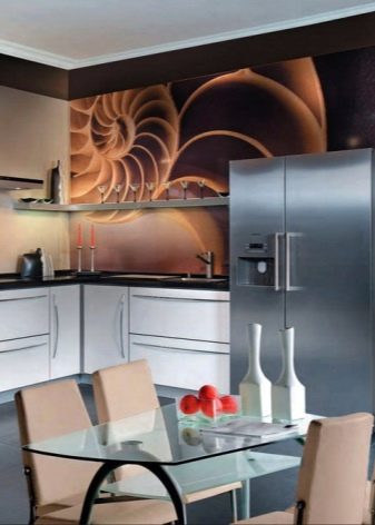
In a larger kitchen, a bare wall can create a feeling of emptiness. Therefore, it is quite possible to make a bright and high (your standard) apron of a beautiful tile or glass. After the apron - part of a smooth wall and ceiling.
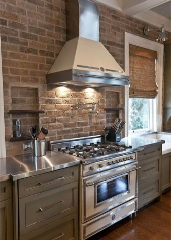
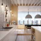
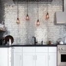
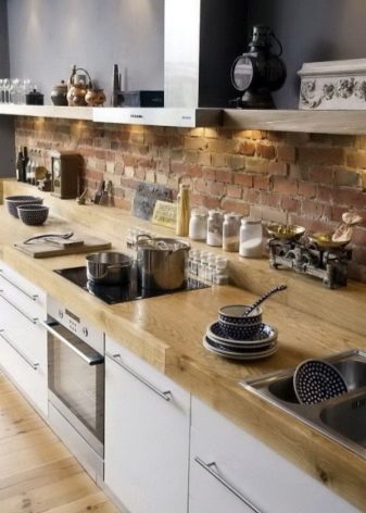
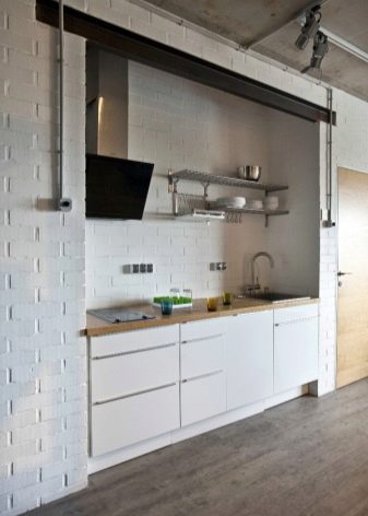
For loft-kitchens, rooms with an urban design, brick masonry or its imitation is often used. In this case, this "apron" goes to the ceiling. To keep the brick wall from looking empty, you can hang lamps on long cords above the working surface, which will create an additional “pattern”.
The wall can be decorated with interior stickers, posters, murals or paintings in frames or on stretchers.
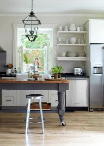
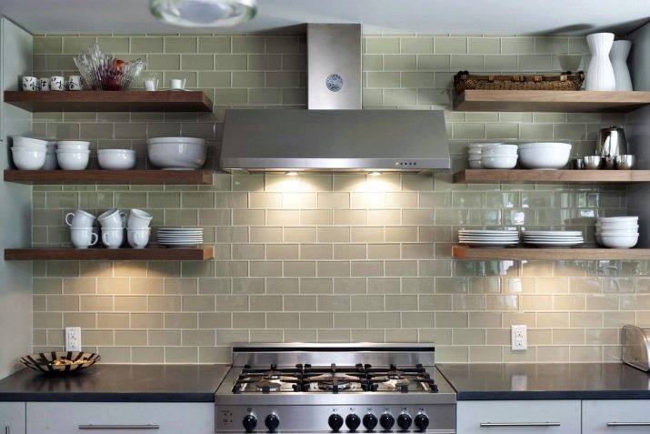
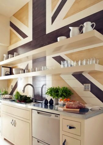
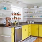
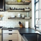
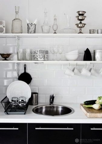
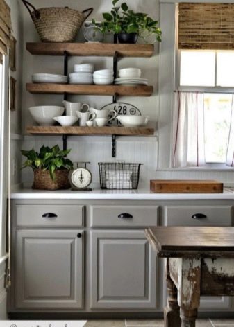
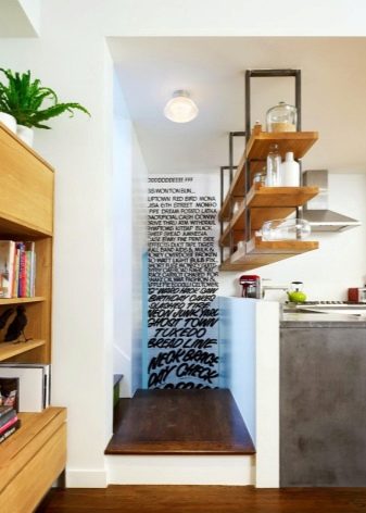
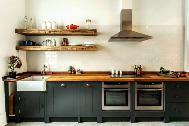
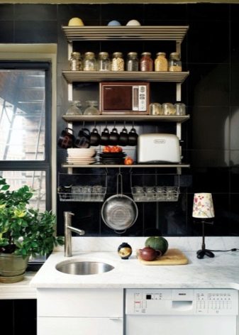
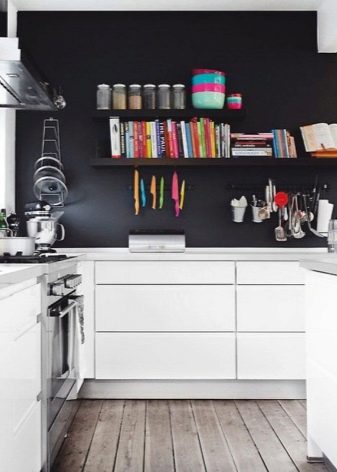
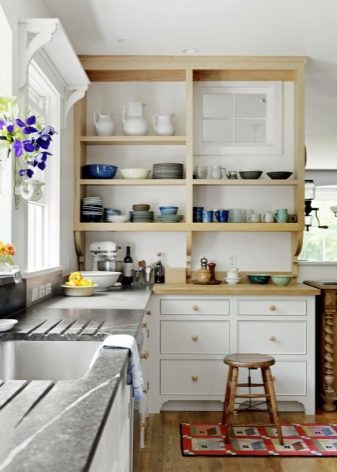
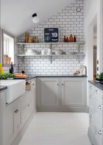
For kitchens, where the wall can not be purely decorative, and still need to somehow use the area, we can offer an option with shelves. At a minimum - one or two or many shelves up to the ceiling itself - in different styles both of them look good. On such shelves you can place dishes and jars of spices.Experts advise to put there something that is constantly used: then there is no dust on the plates and mugs, and the shelves themselves will not have time to get dirty.
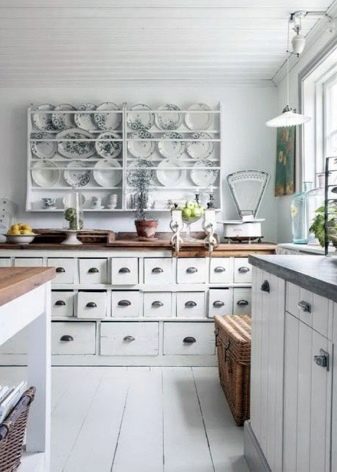
If the shelves are exclusively decorative, place plates from journeys, flower arrangements, etc. on them. But remember that they will constantly have to restore order.
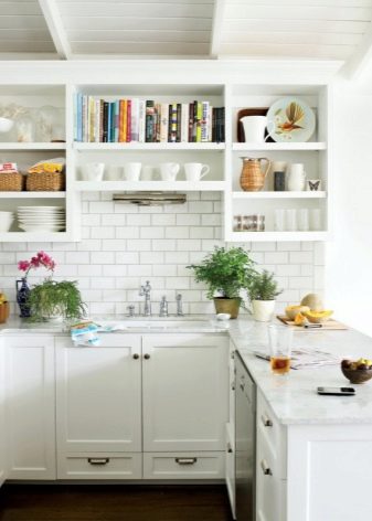
By the way, the shelves can be deep, that is, with side walls and a "roof". Something like cabinets without a door. Such designs - square and rectangular are combined in different combinations, creating an original pattern.
In addition to shelves or solo, you can install modern rails on the wall. Hooks are usually broadcast on them, and in this way are placed mugs, pans, towels and other kitchen textiles - in other words, everything that can be hung. Roof rails are beautiful, stylish and catchy, but according to reviews, this is a potential place for confusion. Therefore, you should not rely on rails as a serious storage system.
Single-deck suite allows the use of 1-2 small wall cabinets. Such “dot” cabinets with glass doors or lattice will look very good.But - an important rule - they must be located outside the work area. Most often they are hung around the edges or in the corners.
Rational storage on the lower tier
For the lower row of furniture in such a kitchen is a difficult task - to accommodate all stocks of food and kitchen utensils, appliances and utensils. Boxes must be:
- Resilient;
- deep;
- with the possibility of embedding technology;
- With smart systems for compact storage.
When designing, you need to carefully consider how many and which boxes you need. In standard headsets 2, 4 or 6 drawers. At the same time, it is actually used from strength two (cutlery and various trifles are stored there). Others are misused or empty. Accordingly, you need to decide how many drawers and regular drawers you need and what will be stored in them.
A very expedient solution is to build a shelf in the cabinet under the sink. Usually there is a garbage can and pipes, however, if you select at least a small shelf, you can clean household chemicals, sponges and rags there - so as not to litter the sink.
Shelves should be under the main worktop (work surface).Experts recommend installing them at different heights so that you have high and low compartments. Then they can be conveniently placed pans and pots.
Simple drawers of different heights from the inside should be divided by partitions. This can be done at the design stage, and you can embed the dividers already in the finished headset. So it will be possible to compactly place all the items so that nothing is lost.
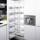
For a single-tiered headset, full-retractable systems are very suitable when the deep drawer rolls forward to the very end, but does not fall. This will allow you to find the item you need, without getting into the box with your head. In addition, these drawers silently and smoothly closed.
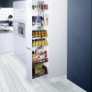
For kitchen without top cabinets, multi-tiered drawers are ideal when there are 3-4 shelves behind one facade. Opening the facade, you pull the highest bottom shelf. The rest are opened at will, or (if the “leash” system is used), they “crawl” behind the bottom drawer.
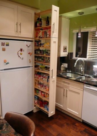
Retractable or round shelf carousels can be placed in corner cabinets. Be sure to take a look at the bottle - narrow lockers, behind which is drawn metal mesh basket for bottles with vinegar, sauces, seasonings.
Successful examples of planning and design
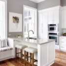
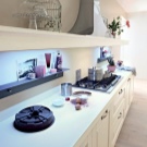
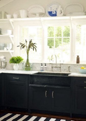
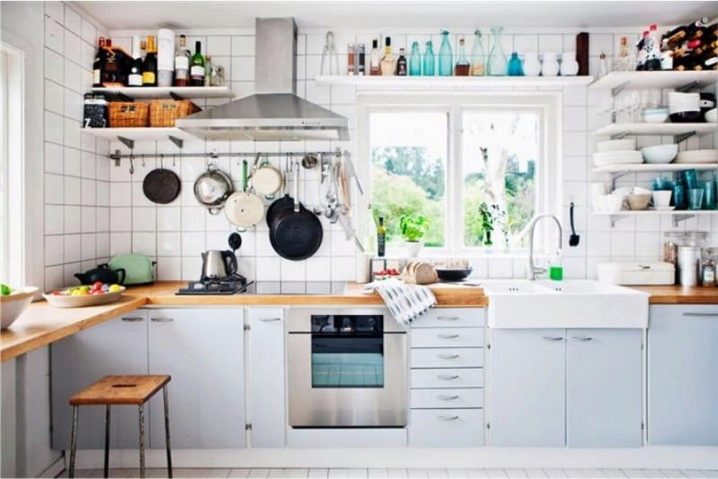
An example is when a single-tier kitchen does not look empty at all. Moreover, a little more and with objects on the walls will be overkill. The sink is located by the window: the room is very bright. The congestion of the walls with small details is balanced by the utmost simplicity of the furniture - a light blue inconspicuous set, a wooden tabletop, a screen of modest white tile. The shelf above the window looks very good: the bottles on it are most likely decorative, but they create a very special mood in this interior.
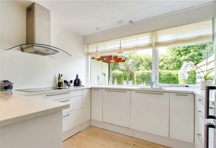
With such a large window litter the wall is just a crime! Full minimalism: on a perfectly flat walls only the hood, originally decorated with glass, flaunts. But the headset is installed almost round - such a large number of cabinets made it possible to hide all the dishes and appliances inside. Salt, pepper, bottles with oil and a kettle - only the most important thing outside.
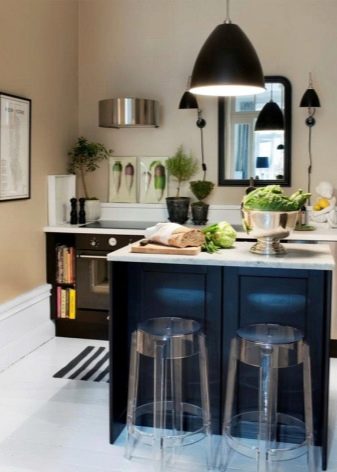
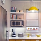
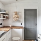
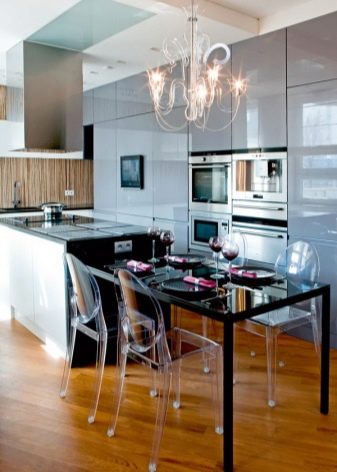
The combination of white headset and walls with a metallic sheen of utensils and appliances looks a bit cold and "sterile." Therefore, the designers diluted this interior with a deliberately uneven wooden table and a tonal lamp. Decorations on the walls to the country style.Literally, the “hospital” white color here is complemented by greenery on the shelves and a very elegant bookcase. It is worth paying attention - the kitchen is quite small, but it is the absence of the wall cabinets and the bright colors of the furniture that make it visually more spacious.
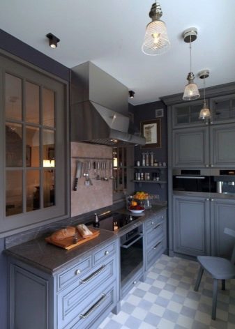
Another small and narrow kitchen with a small window. The headset with the letter G allows you to use all the lower space, and on the wall there is only one small group of cabinets with lighting for the work area. Color accents is a plate and a small table.
A new approach to the organization of a sufficiently large space: overall cabinets. They take up space, but they fit everything: there’s probably a very thoughtful storage system inside. The long island bar counter, at the bottom of which are also located cabinets, has a built-in stove and sink. On the wall are three short shelves. Only three colors were used in the interior - nothing superfluous.
