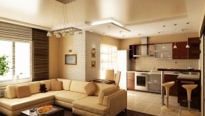
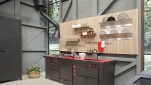
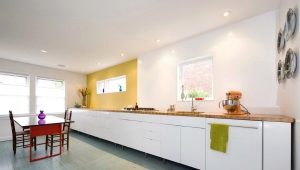
Kitchen without top cabinets
The choice of kitchen sets in modern furniture stores is very large, so creating your own unique kitchen design is very easy. Relatively recently, the designers came up with a new “chip” in the design of the cooking zone - a kitchen without top cabinets. At first glance, it seems that such a “defective” design is not very appropriate and functional, but in practice everything looks different.
Advantages and disadvantages
A kitchen without wall cabinets is an interesting and unusual solution in creating an apartment design. Despite established stereotypes in terms of two-tier headsets, such models are quite popular.
Pluses headsets without hanging lockers:
- Extra space and visual space of the room. Looks great if the kitchen is small enough.
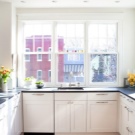
- Maximum accommodation options (without lockers at the top of the headsets can be positioned even under the window).
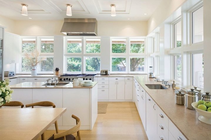
- Maximum light in the kitchen. Without hanging cabinets, the light from the chandelier will evenly reach the cooking zone and additional lighting may not be useful.
- Lack of "dust collectors".Due to the fact that classic headsets have a great height, it is very difficult to get to the very top, therefore dust accumulates there. A modern model without a top "will not force" you to constantly climb and check for dust.
- Availability. The kitchen suite has a standard height, which is why miniature housewives often have to get up on their toes or hold up a chair to get another cup.
- Finance savings. Single tier set has a lower cost.
- Security. If you fix the top cabinet poorly or exceed the permissible weight of its filling, then it may fall.
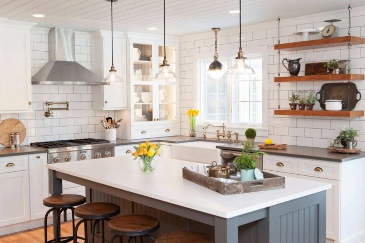
In addition, it is possible to note the possibility of the original decor of a free wall above the working area: paintings, shelves, photographs, etc.
Types of layout
You can decorate the kitchen using a single-level headset yourself, knowing the rules and types of planning. There are 4 options:
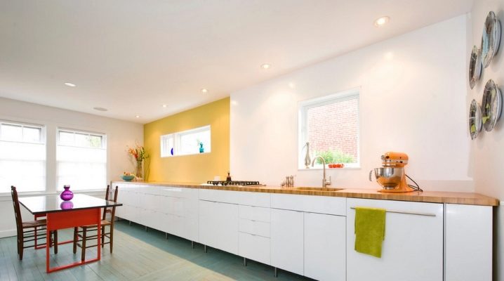
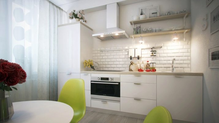
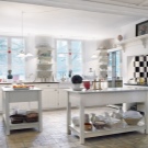
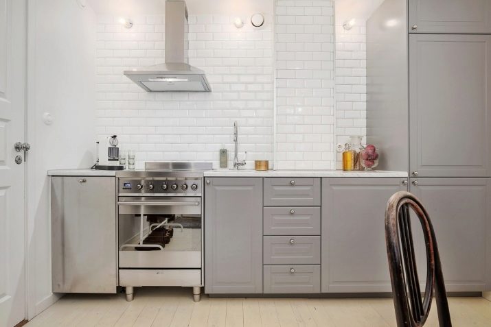
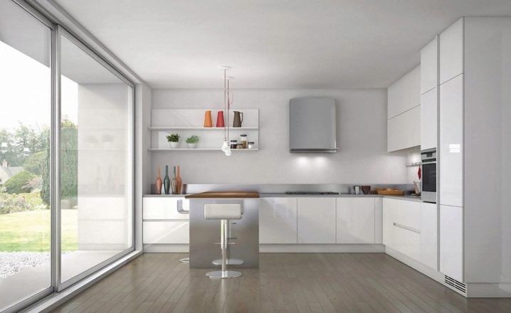
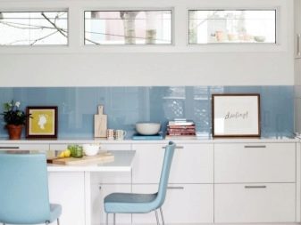
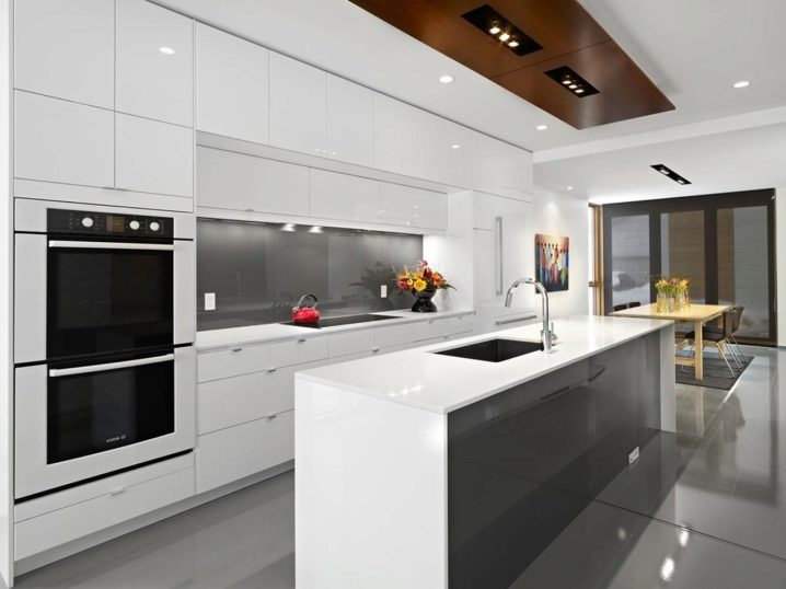
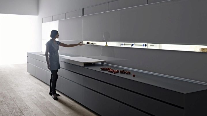
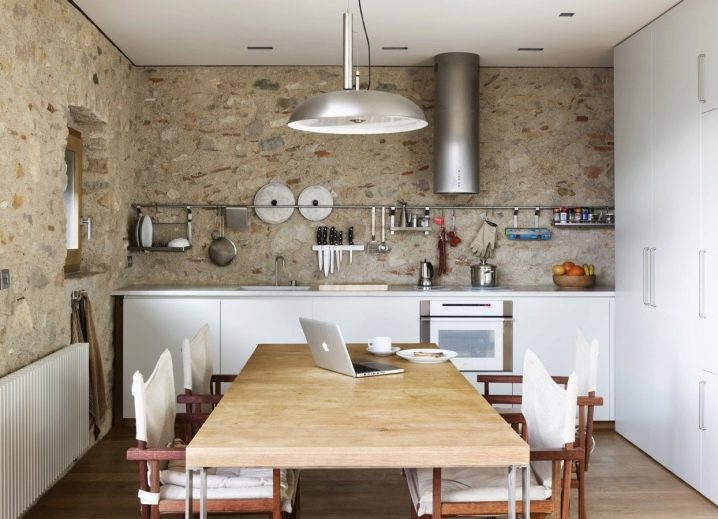
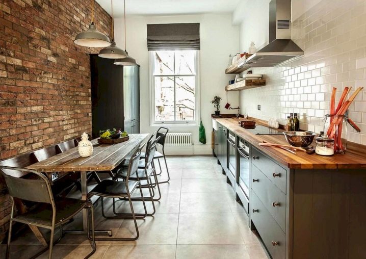
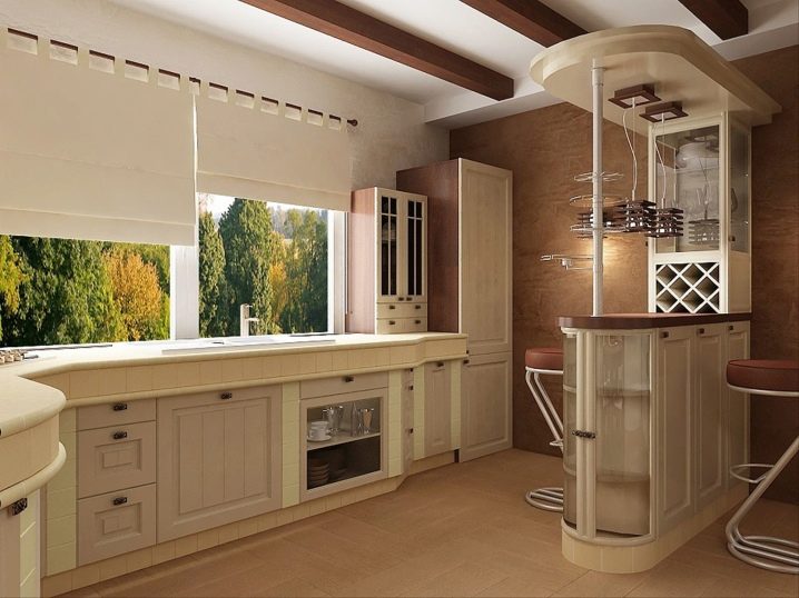
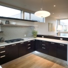
- Linear. The classic option for a spacious or narrow kitchen. As seen in the photo, the headsets are located along the longest wall.
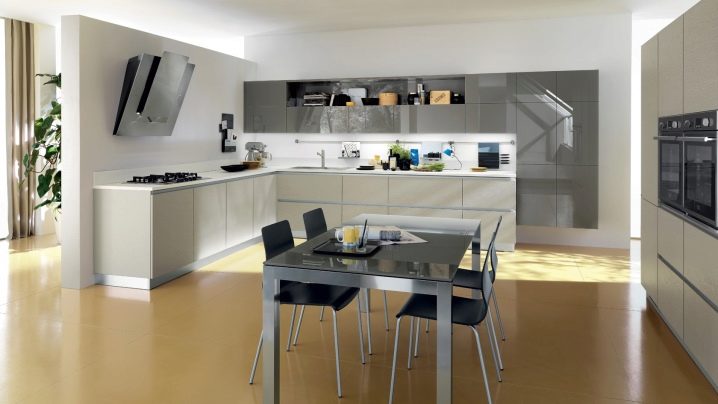
- In the form of the letter "G" or angular. One of the most common options for kitchen design, as it takes up minimal space.
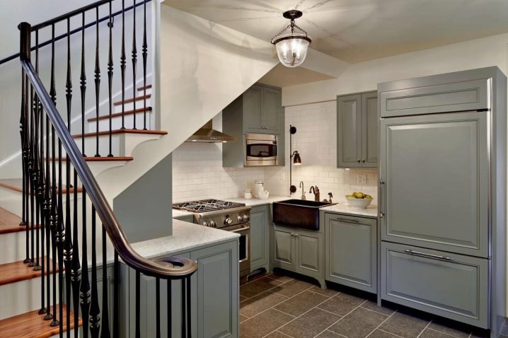
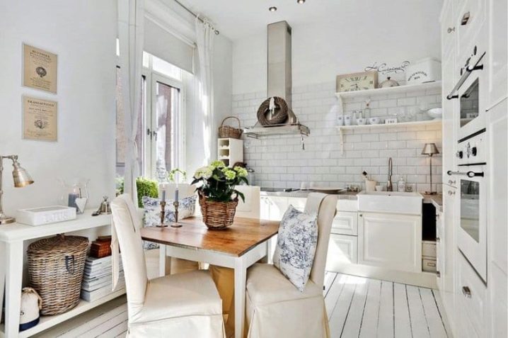
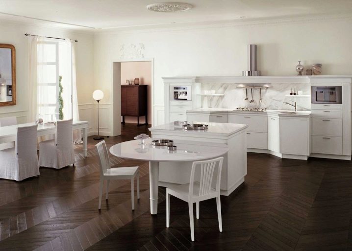
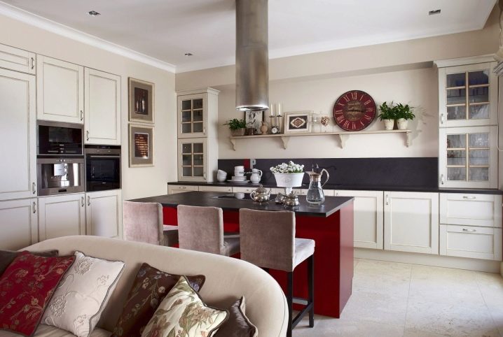
- Parallel arrangement. A small white kitchen in a classic style, on one side of which standard floor cabinets are placed, and on the other side, column cabinets that practically dissolve in space.
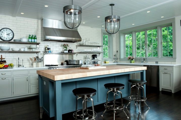
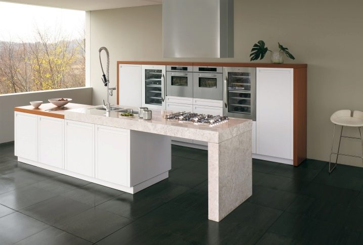
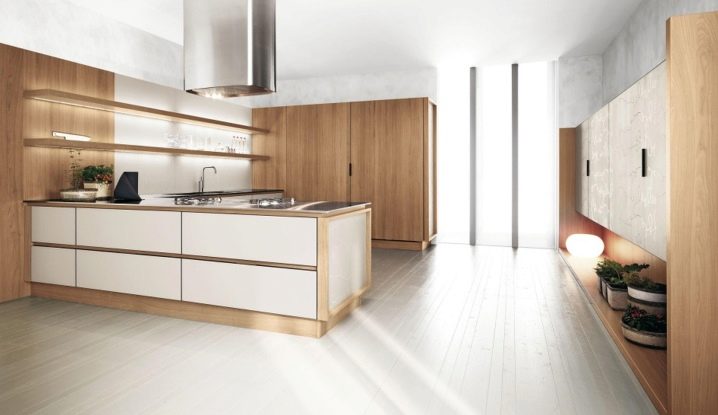
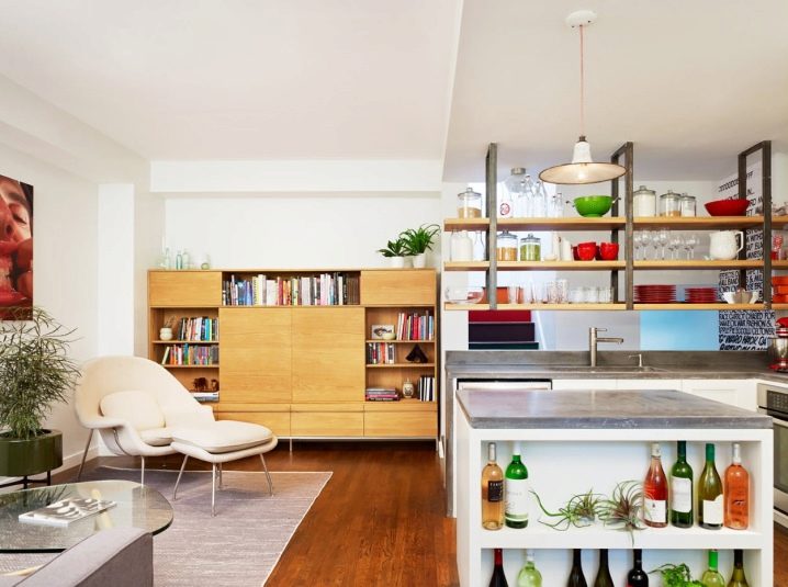
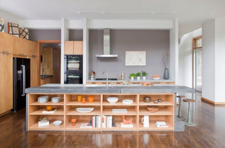
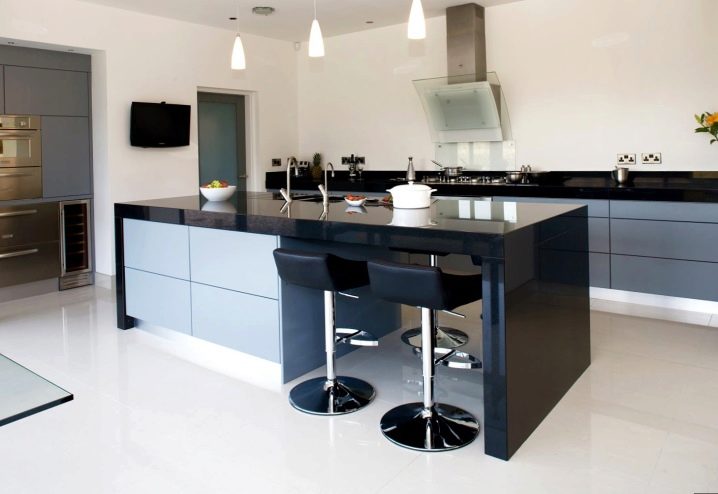
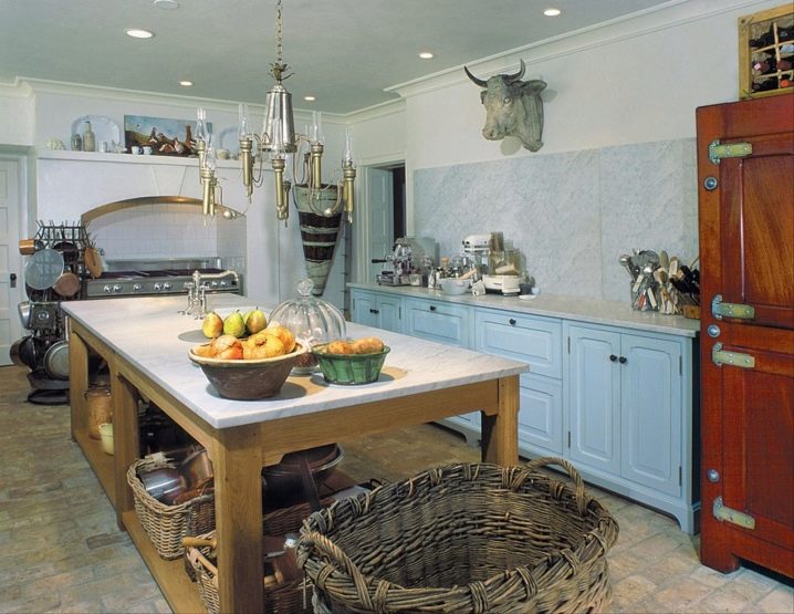
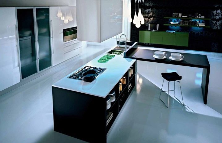
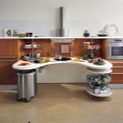
- Island. An interesting design option for a small kitchen area in which the working area is located in the center, and shelves or cabinets-columns are located along the walls.
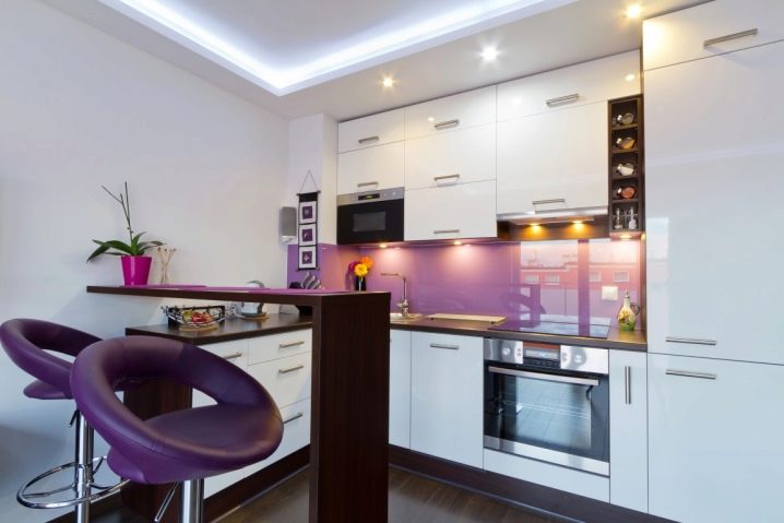
- U-shaped. An option that can be implemented in a spacious kitchen, and in the "Khrushchev"
Interior decoration
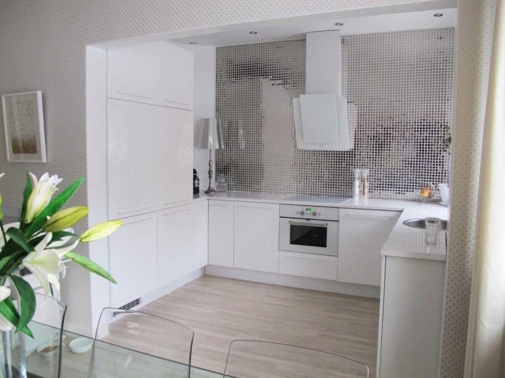
To single-level kitchen was not only practical, but also beautiful, it needs to be properly arranged. Especially it is necessary to draw on the apron without the upper cabinets, as it will be very attractive if you leave it intact.
Finishing the wall above the working area should consist of properly selected and high-quality materials like ceramics, natural stone or heat-resistant glass. This item is very important, since ordinary wallpaper in this place is impractical.
Apron design options:
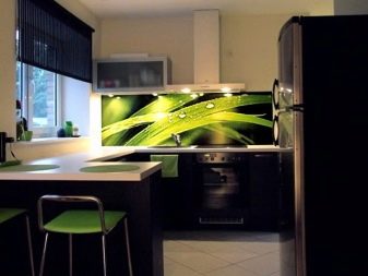
- Glass surface with photo printing;
- Glass panel or mosaic;
- The laminated plate from MDF or a chipboard.
It is very important when designing the kitchen area to consider lighting in the cooking zone. The ideal option - wall moving lights.
What can replace cabinets
If you prefer single-level kitchen, but do not want to have a completely empty wall, then you can try something to replace the standard wall cabinets. Some interesting options to replace:
- Case column. Very handy, albeit overall piece. The main plus is the ability to build in it the most different kitchen appliances. The column cabinets are usually located opposite the headset or on both sides of the floor cabinets.
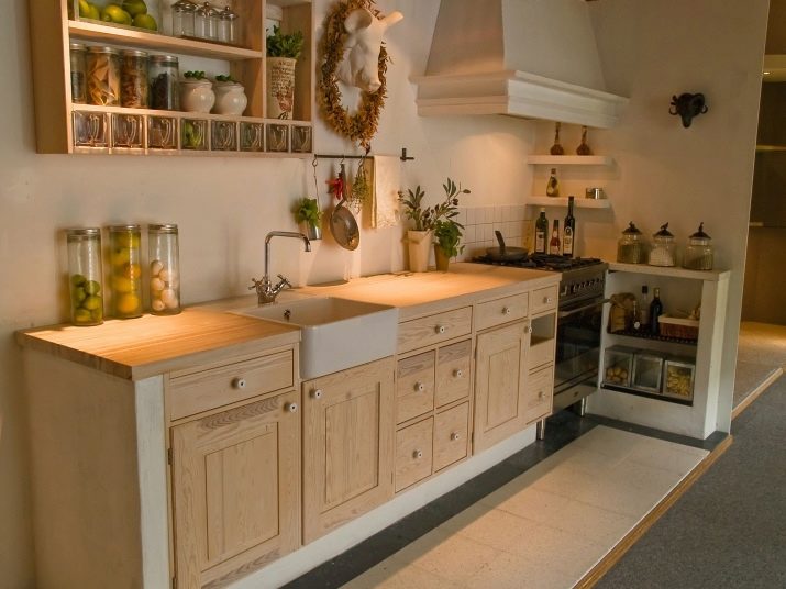
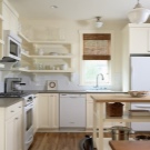
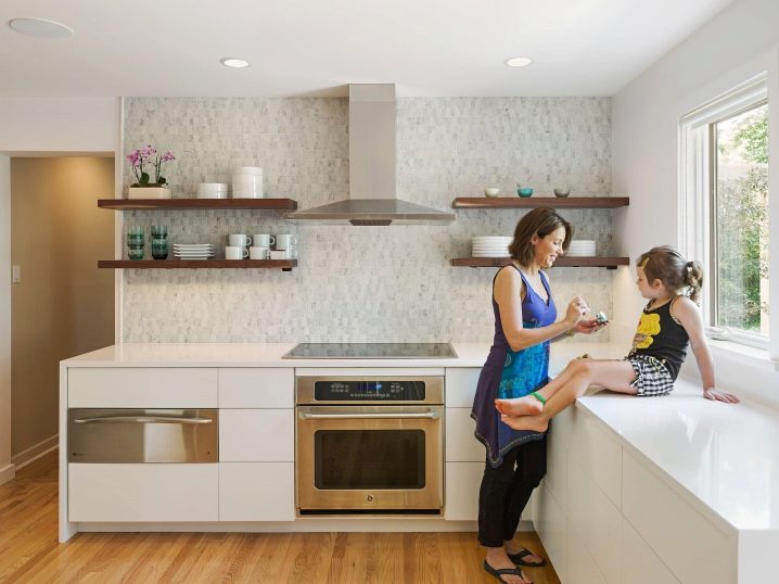
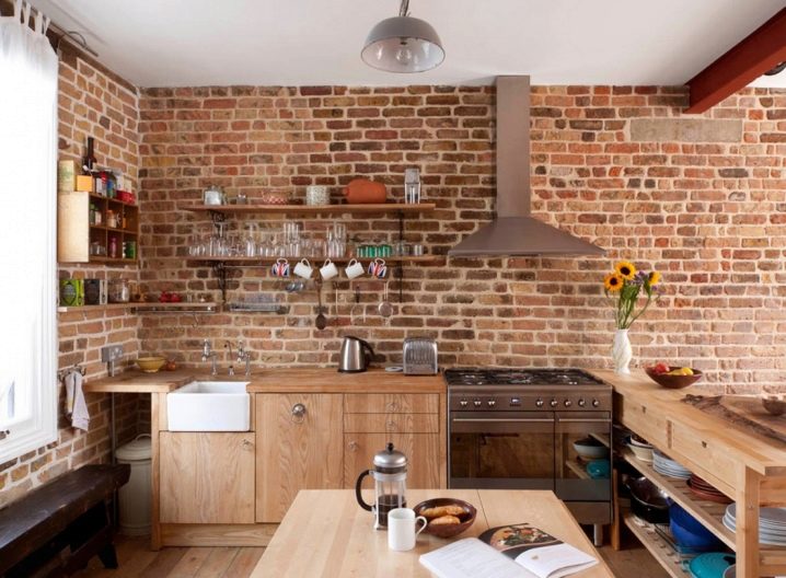
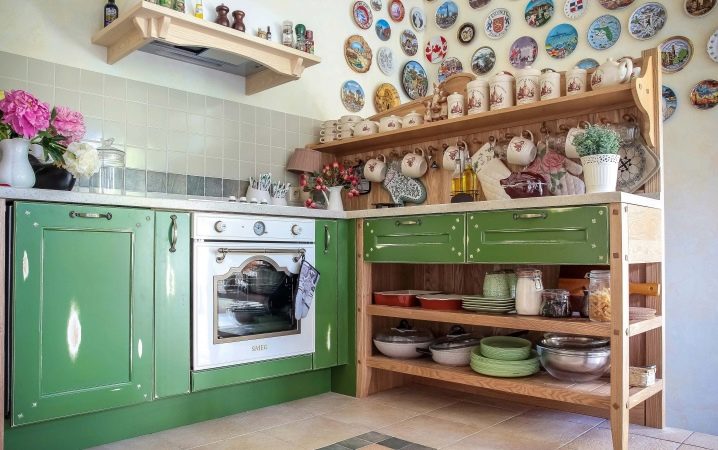
- Open shelves. Light and airy alternative to bulky hanging cabinets, most often used in the style of "Provence." Shelves can be used to store beautiful dishes or jars with loose seasonings.
- Sideboard, sideboard, rack, closet-case. Whatever you choose from this list, observe the style and color design of the kitchen area.
- Rails. Almost the same as open shelves, only this construction is lighter and is made of metal. On the roof rails you can not only arrange, but also hang objects (scoops, pot holders, paddles, towels).
As can be seen from the above, there are plenty of alternatives for wall-mounted cabinets, so you should not be afraid of single-level kitchens, thinking that you will have very little space to store kitchen appliances.
How to decorate the walls
What to replace the cabinets we have dismantled, you can now delve into this issue a little more and disassemble examples of how to decorate the empty walls. Finishing the vertical surface above the working area should not merge with the space, so it can and should be decorated in a special way.
Several interesting wall designs in a variety of styles:
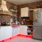
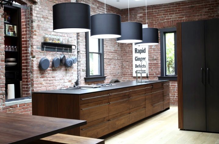
- Brickwork. The original kitchen in the style of "loft". Despite the fact that all the walls are decorated the same way, the space above the lower tier does not look empty.
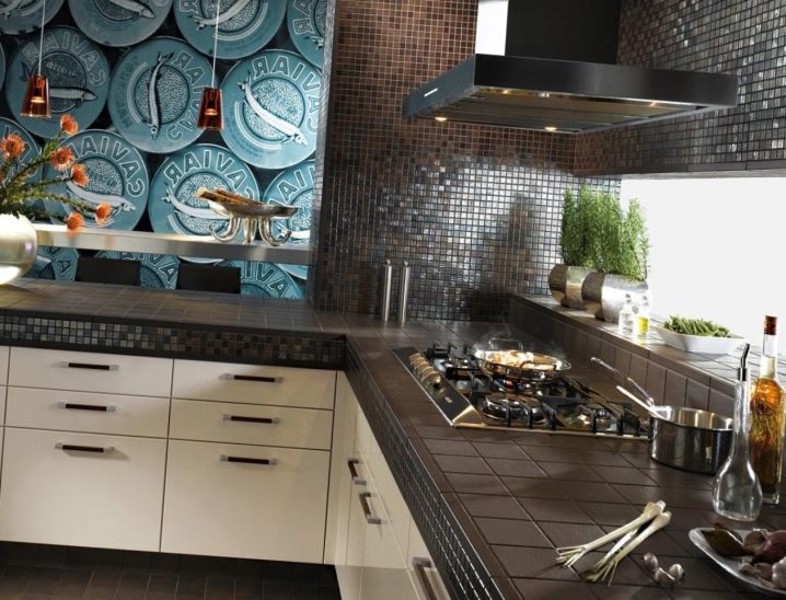
- Mosaic from ceramics. In black, such an apron design looks very impressive. In this example, the kitchen is made in the style of "minimalism". Other walls are perfectly combined with the working area, as they are painted in a similar silver-gray color.
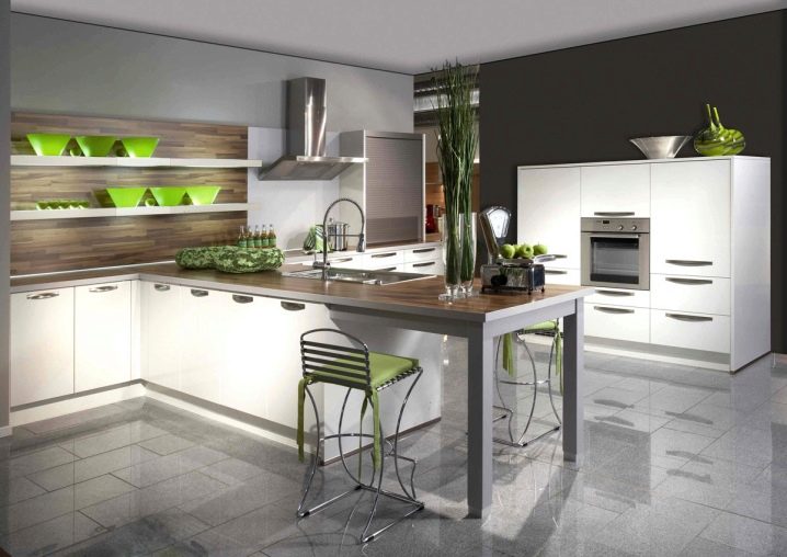
- The laminated chipboard panel. The apron is made of wood very beautifully, also due to the contrasting color, it helps to zone the space by highlighting the working area on a white background of the remaining walls and ceiling.
- The panels are made of wood, made from the same material and in the same color as the kitchen set. over storage and eating areas. The stone contrast wall above the cooking zone is identical to the hob and the dining table. This design looks elegant and quite practical.
- Rough loft-style masonry looks original and very cozy; It is perfectly combined with wooden panels and metal modern kitchen furniture.
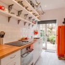
- Orange mood in the style of Provence. Brick wall and functional racks for dishes perfectly harmonize and look rustic in a cute.
Single-level suite in the interior
Many people believe that a headset without lower cabinets does not fit into the interior of a modern apartment and looks out of place. We dispel these myths and present you a selection of photos of a single-level kitchen, decorated in the most common styles.
Country Style Kitchen
You live in a noisy city, but you want to have a cozy kitchen in a rustic way? Feel free to choose country style. It combines rural charm and modern functionality.
The main features of the "rural" design:
- Natural materials: furniture, decoration, decor;
- Simplicity, artificial antiquity and ostentatious rudeness in the design;
- Calm color palette.
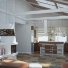
An interesting option for country-style cuisine in a modern apartment. As it should be, natural materials of soothing natural shades are used in the decoration. Gray stone floor in harmony with the ceiling made of natural wood. The worktop top perfectly coexists with a modern single-level kitchen. A little rough finish diluted walls painted in light and dark gray shades.
Provence
Cozy and gentle French "Provence" conquers with its romance and naivety. Do you want to build in your apartment an island of delicate village life? Then make out the kitchen in the style of "Provence".
The favorite colors of designers who create a piece of France in a modern kitchen are saturated colors, as if diluted with milk: olive, wheat, mustard, turquoise, lavender, etc.
Material for furniture is better to use natural, since the "Provence" is characterized by elements of antiquity. A set without wall cabinets will ideally fit into such a kitchen, because the numerous shelves of wood are one of the remarkable features of the Provence.
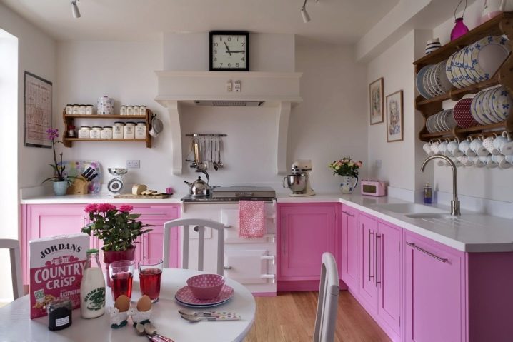
A vivid example of Provencal interior: dairy walls, fireplace extract, wooden carved shelves, flowers in vases, pale pink set, wood color floor.
Modern
The kitchen, decorated in this modern style, is a real piece of art. The uniqueness of this design lies in such features as:
- A variety of design solutions;
- Practicality;
- Restraint;
- Conciseness.
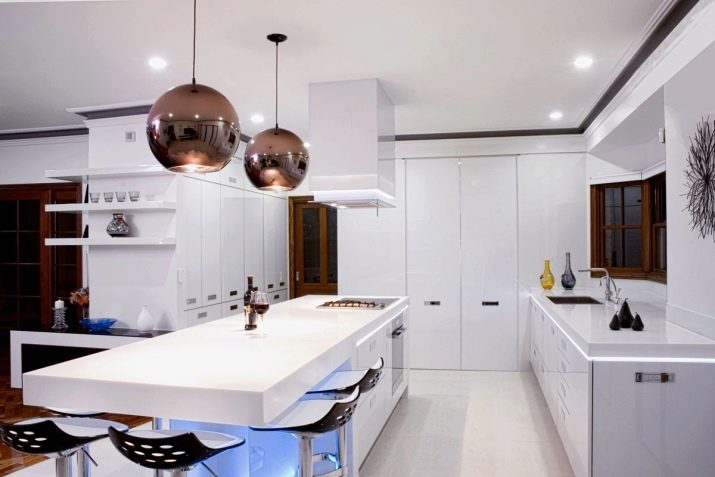
Design in the style of "modern" differs geometrically correct furniture with glossy surfaces made of metal, glass and plastic. Lighting should be presented in the classic version: a large chandelier and single lamps. It is also possible to use LEDs for backlighting.
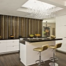
An example of a classic modern style with bright accents (Fig. 19). The design of this kitchen looks smart and stylish. Rectangular white furniture with black worktops, a classic chandelier and floor, bright spots in the form of gilded chairs and original mosaics above the working area are the key to a successful modern design.
Futurism
This design style was developed specifically for those who are alien to tradition and standard views.Futurism is a new and unusual direction in the design world, the adherents of which are young and energetic people.
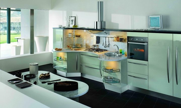
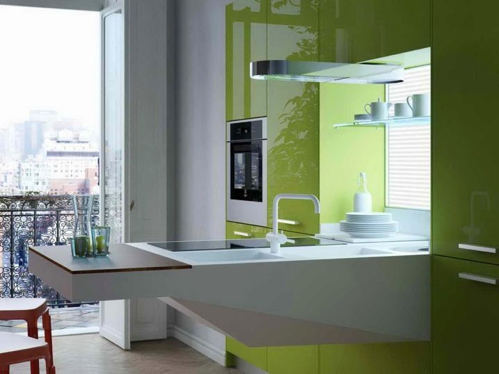
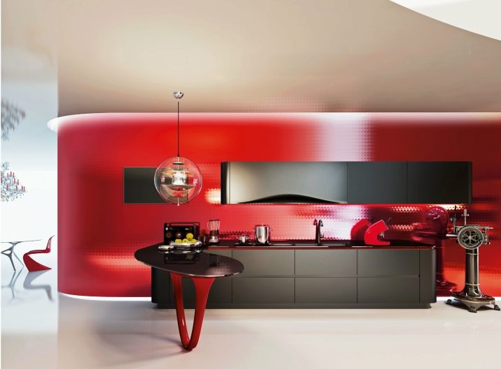
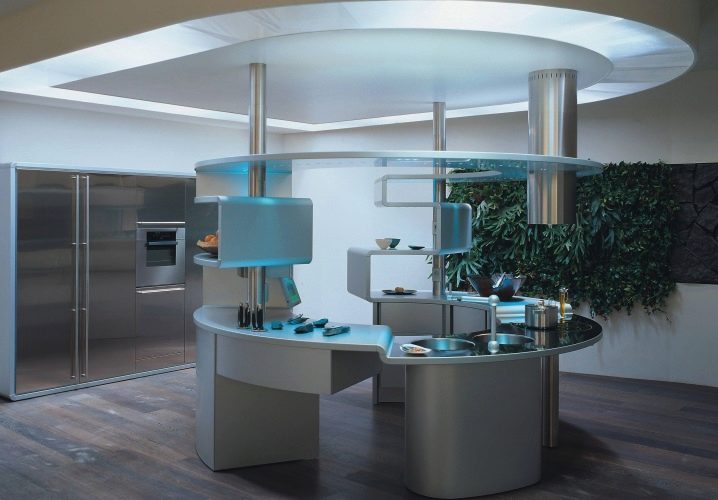
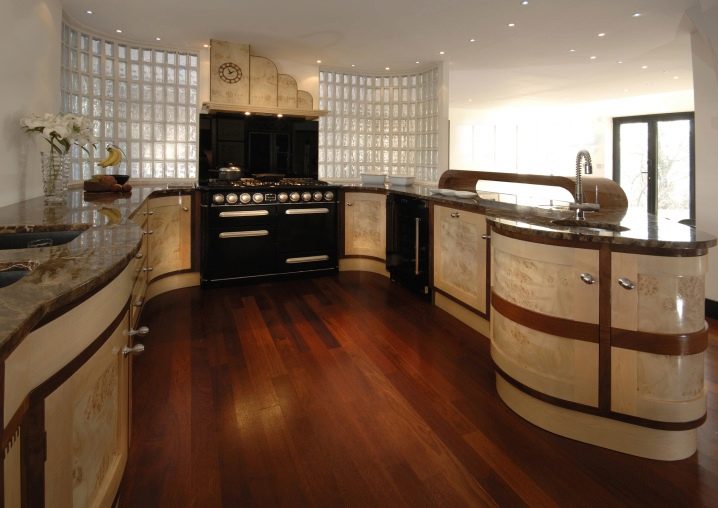
With the help of modern technology, you can “revive” a lot of futuristic ideas in the interior of the kitchen. The basis of this style are steel and white shades, which can be easily diluted with rich details in the form of original furniture or wall paintings. Do not forget about the main feature of futurism - an unusual and often curved form of furniture.
A bright but slightly restrained example of futuristic cuisine.
Art Deco
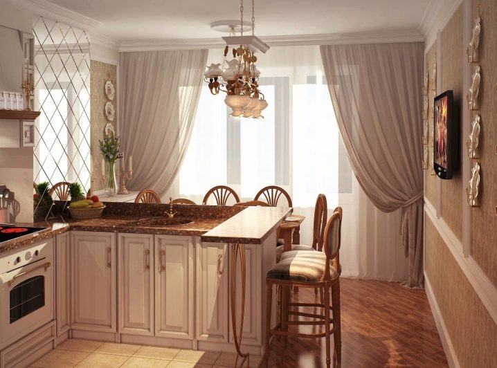
This style is distinguished by a special luxury and chic. Most often, the luxurious design of the kitchen is used in spacious apartments and country houses, where the cooking zone is competently combined with the living room or dining room.
Distinctive features of art deco:
- Fretwork and textiles in the design of the walls;
- Noble colors and intricate patterns on the walls;
- Natural (dark and red woods) and expensive materials at the base of furniture (gold, bronze, silver, brass, chrome steel);
- Details from crystal and magnificent ceramics.
Furniture in the art deco kitchen should be decorated with special chic (leather, velvet or jacquard inserts) and have a certain geometric shape.The most common shades for decorating walls and furniture of a luxurious kitchen: beige, silver, gold, gray and milk shades.
A kitchen without upper cabinets is now quite rare, but this does not mean that such a design move is ineffective. Why are there so few single-level kitchens? Yes, all because the majority observes the tradition in interior design and is often afraid to experiment. A kitchen without drawers is not only beautiful, but also practical enough in a small room.
